
⚠️TORNADO WARNING: 🌪️ 🚨 Zookeeper Creates 3D Interactive Product Configurator for Perry Weather
By Dave Waite • October 13, 2026
How do you make a complicated weather-safety system instantly easier to understand? Let people get their hands on it. Virtually.
A great product demo answers questions before someone has to ask them.
Perry Weather came to us with an industry-leading weather-safety platform—and a huge challenge:
How do you make a highly technical mix of hardware, sensors, connectivity, alerts, audio, software and dozens upon dozens of possible configurations easy for a buyer to understand quickly?
We started with CAD drawings, product PDFs and a whole lot of technical information.
Then we rebuilt the hardware in 3D, created dozens of configurations, added 360° product exploration, animated real weather conditions and wrapped it all inside a custom interactive experience built to help prospects see how the system works.
Not just a product configurator. A sales tool designed to make complexity clear. And something a buyer can understand in seconds.
A fully interactive 3D product experience.
Spin the hardware 360°.
Change the configuration.
See different alert states.
Watch the weather change around it.
The experience changes. So can the content.
Wind. Rain. Severe thunderstorms. Flash flooding. Tornadoes. Extreme heat.
And because the whole thing is backed by a custom control system, Perry Weather can keep updating products, packages, mounting options, environments and alerts as the system evolves.
The result feels less like clicking through a sales presentation and more like watching the system do the job it was built to do.
Best of all we turned it all into a dead-simple WordPress plugin that seamlessly integrates and works across all browsers, tablets and mobile.
Take Perry Weather for a spin: https://zookeeper.com/portfolio/perry-weather
My Great AI Conspiracy Theory
By Dave Waite • October 2, 2026
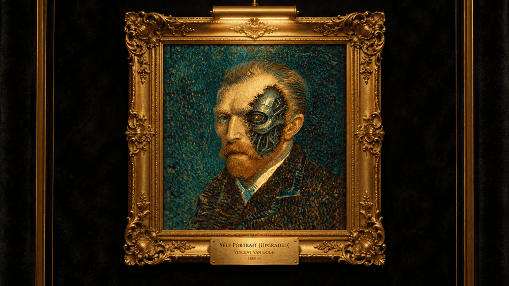
Apparently, the modern equivalent of cutting off your ear is saying something nice about AI on LinkedIn.
So here’s Vincent as the Terminator T-600 model. I figured we might as well get the discomfort out of the way early.
I love a good conspiracy theory. Give me a lost civilization or something suspicious happening at Area 51 or a frozen pyramid in Antarctica, and I’m entertained. I don’t have to believe it. Half the fun is wondering whether the story everyone accepts has a few holes in it.
Lately, I’ve been wondering about one in our own industry.
Somehow, we’ve arrived at the idea that the only relationship an artist can have with AI is competition. Touch the tools and you’re helping build your own replacement. Refuse to touch them and you’re standing up for creativity.
What a miserable bargain for a profession built on curiosity.
I run an animation and branding studio. The people making the work are my colleagues and friends, so this isn’t an abstract discussion. We care whose work went into training these models. We care whether they agreed to it and whether they were paid. And a company using AI as an excuse to get rid of its artists is not going to get a standing ovation from us.
Those concerns deserve actual answers. “Progress is inevitable” is a pretty lousy response to someone worried about paying their rent.
But I’m having trouble with the leap from having legitimate concerns to deciding we shouldn’t learn how any of this works. Somewhere in there, curiosity became suspicious. An artist experimenting with a tool now risks being treated as though they’ve joined the other side.
That’s a strange place for us to land.
Creative people are usually the ones pushing every button to see what happens. We break the software. We figure out how to make it do something its developers never considered. Give us a new way to make something and somebody will stay up until 3 AM messing around with it.
We did that with Photoshop. We did it with 3D and motion capture. The fact that we learned those tools doesn’t settle the argument about AI, but it does make me question whether refusing to learn is much of a strategy.
Especially when so much of a creative person’s day gets eaten by work they’d happily hand off.
Nobody lies awake as a kid dreaming of a career renaming hundreds of files and rotoscoping file after laborious file.
Yet there they are. Along with the cleanup, the asset organization and the seventeen versions of an export because every platform needs something slightly different. Somewhere underneath all of it is the idea you were excited about that morning.
Some of that work takes serious skill. People earn their living doing it. I’m not dismissing either of those things. I just don’t think respecting the work requires us to preserve every tedious hour involved in getting it done.
If a tool can give someone an afternoon back, I’d like to see what they do with it. Maybe they find a better expression for a character. Maybe they try the strange idea nobody budgeted for, like adding an animated Leprechaun as an Easter Egg and see if anyone notices. Maybe they go home at a reasonable hour and come back with a functioning brain.
All perfectly good outcomes.
Of course, that only works if we let the saved time become something worthwhile. If we immediately fill it with more deliverables and tighter deadlines, we’ve built a faster hamster wheel. Calling that a creative revolution would be generous.
There’s something older underneath this argument, too. We have a long habit of enjoying what artists give us while being a little dismissive of the people doing the giving.
The court-jester arrangement.
Come entertain the important people. Make the room more interesting. Perhaps say something uncomfortable that nobody else can get away with saying. Just remember who gets to make the serious decisions.
We’ve updated the vocabulary. Now someone is a “creative type.” A dreamer. The person brought in to make things pretty after the important thinking has been done.
We romanticize the starving artist right up until he sends an invoice.
Meanwhile, artists are giving businesses their identities and movements their symbols. They’re helping people understand things that a page of explanation couldn’t get across. They’re imagining worlds other people might eventually figure out how to build.
Even the jester had something going for him. He could tell the king the truth.
That ability to notice something, give it a form and make people pay attention is a substantial part of what artists do. It’s difficult to put into a procurement spreadsheet or KPI, which may explain some of our problems.
Then a new technology arrives and we do the whole dance again. The machine is revolutionary. The platform is worth a fortune. The artist working with it is somehow just making pictures with crayons.
AI didn’t invent the idea that artists are disposable. It inherited it.
Which is why I think we’re making a mistake when we defend our value solely around the production of an image. We’re letting everyone else define the job far too narrowly.
Making the thing matters. So does deciding whether the thing is worth making.
AI can generate ideas. Some of them are useful. I’m not going to pretend otherwise just to make the rest of us feel better. But when you have ten thousand options in front of you, somebody still has to make a decision worth a damn. Someone has to be the tastemaker.
In our character work, we care whether the character feels like someone. A beautiful rendering can still be lifeless. The expression can be almost right and completely wrong for the personality. You have to notice that, understand why it bothers you and figure out what to change.
Another hundred variations won’t necessarily help. You may just end up with a hundred beautifully finished versions of the same problem.
That’s where taste and judgment matter. Your sense of humor matters. So does everything you’ve picked up from paying attention to actual people rather than spending your entire life looking at other people’s work.
Those things deserve more of our time.
I’d rather spend an afternoon figuring out what makes a character interesting than wrestling with a production task that a tool could have handled. I don’t feel less like a creative person for saying that. I feel like someone who has other things he wants to get to.
And this is where I think the competitive question gets interesting.
The artist learning these tools may be finding room to experiment that another artist simply doesn’t have. More chances to get past the obvious answer. Enough time to follow an idea that initially looks ridiculous.
That doesn’t guarantee better work. You can use AI all day and still make something forgettable. But having more opportunities to try, fail and improve is an advantage. More seriously than the promise that avoiding the tools will somehow protect us.
There will be artists who study a particular tool and decide it isn’t for them. Fair enough. They may have excellent reasons. I’d just like that decision to come from an honest look rather than the fear that opening an application makes them a traitor.
I’m not asking anyone to trust an AI company with their future. I’d be very careful about that myself.
I am asking why we would hand over our curiosity so easily.
That’s my conspiracy theory, really. No secret society required. Just a profession full of imaginative people being told that the responsible thing to do is stop exploring something.
We can demand better answers about consent and compensation while learning enough to have a say in what happens next. We can object to how a tool is built without pretending there’s nothing to learn from understanding it.
I don’t know exactly where this goes. Anyone offering artists a completely painless future is selling something.
But I know what I’d rather be doing with my afternoon.
Let the Terminator resize the files. We’ve got worlds to build and stories to tell.
I have a confession to make. I’m an addict.
By Dave Waite • September 24, 2026
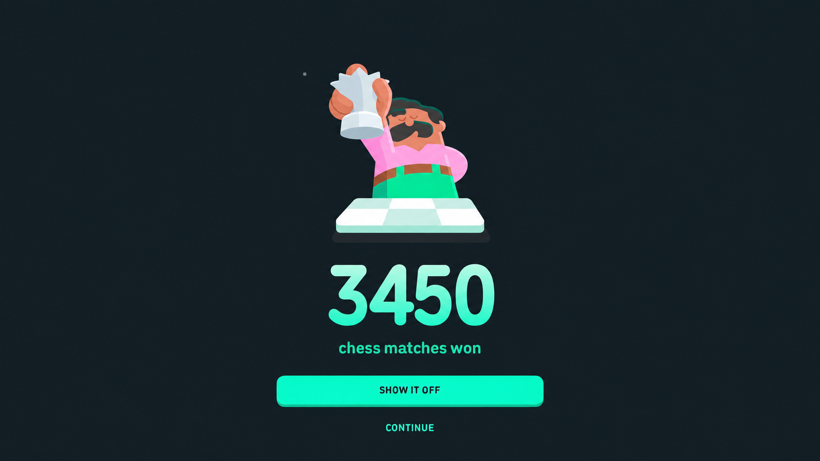
Hi, my name is Dave. And I’m an addict.
And I need to give you fair warning so you DO NOT make the same life mistake I did.
I first signed up for Duolingo a dozen years ago. I’ve dabbled in learning Norwegian and refreshing my Russian, then was making my way through the Spanish lessons. All seemed like a perfectly reasonable use of my time. Learn a language. Exercise the brain. Be ready for travel in much of the Spanish-speaking world…
Then Duolingo introduced a new “language” to learn in spring of 2025.
I’m about to give you a warning that could be life-altering.
Do NOT, under any circumstances, start playing the chess app on Duolingo.
It is highly, highly addictive.
I’m telling you this so you have a chance to save yourself.
You have things to do. People who care about you. Plans that don’t involve a cartoon man named Oscar with a magnificent mustache.
Last year’s big initiatives around here were getting our new Zookeeper site up and trying to hit a golf ball straight. Somewhere between those two projects, I apparently decided I needed another game that could make me question my judgment.
The irritating part is that I run an animation studio. I spend my working life thinking about how characters connect with people. You’d think I’d have some immunity to this.
Apparently, knowing how something works does very little to protect you from it.
Duolingo eases you into chess through short lessons and puzzles, with its character Oscar serving as your coach. You work through a problem, try a tactic and eventually put things together in matches. It gives you something manageable to figure out rather than dropping you in front of a board and wishing you luck.
That’s dangerous territory for me. Give me a problem I can almost solve and I’m going to want another crack at it.
Then there’s the familiar Duolingo business of keeping your streak alive and accumulating XP. Chess lessons count toward that streak, too, so there’s very little standing between a respectable language-learning habit and whatever this has become.
The whole thing comes with an excellent excuse: I’m learning. This is good for me. Surely this is better than whatever else I could be doing on my phone.
You can get away with quite a lot under the heading of self-improvement. Plus my dog Puck needs walks, so you can always squeeze in a game in the elevator ride downstairs, right?
But the game mechanics are only part of what interested me. I keep coming back to the characters and the animation.
Look at Oscar. A chess tutor could have been a voice explaining moves or a box of instructions beside the board. Instead, Duolingo gave the job to one of its existing characters and built his personality into the lessons.
That’s rather brilliant. Chess can feel pretty intimidating when you’re learning it. Having a slightly ridiculous character there takes some of the starch out of the experience. It gives you permission to enjoy yourself before you’re any good.
And the little animated moments matter. A reaction. A pause. An expression that makes a character feel pleased with himself. Those are the details we notice in our work, too. You can spend a surprising amount of time getting something that lasts half a second to feel right.
When it works, nobody thinks about the half-second. They just like the character.
Duolingo has put some serious money behind that kind of work. It acquired Detroit animation studio Gunner in 2022, then motion design studio Hobbes in 2024. In August 2026, it added London’s Animade.
My attention was piqued when an education company started buying animation studios.
That’s a fairly substantial vote of confidence in the people who make these experiences enjoyable. Duolingo has explicitly tied those investments to making its products more engaging and giving learners reasons to return. The animation team is being asked to help solve a business problem that every learning product has: getting people to keep going.
As a studio owner, I find that encouraging. There’s a lot more we can do for a business when we’re involved in how the experience works, rather than brought in at the end with a request to liven things up.
There’s also some clever technology underneath all that personality. Duolingo uses Rive for interactive character animation, allowing movements and expressions to respond to what’s happening in the app. Its speech-animation system coordinates mouth movements with audio without requiring an animator to handle every sentence individually. Duolingo needed to animate dozens of characters across hundreds of courses without inflating app size. Rive’s compact format makes this possible. And with Rive, animations are state-driven. State machines manage complex transitions—like idling, speaking, celebrating, or reacting to answers—making each character feel responsive. It’s an excellent case study of combining animation and technology for exceptional user experiences.
For the video-call feature with Lily, Rive lets the team combine expressions and gestures in real time. She can appear to listen, think or react rather than sit there waiting for the next bit of dialogue.
Most people will never care what software is doing that. Nor should they have to. They’ll care whether the character feels awkward or convincing, whether the joke lands and whether they enjoy being there.
That’s the part I find easy to lose sight of when the conversation gets too technical. All that engineering and animation work is there to make a moment feel natural.
The chess course certainly found an audience quickly. In its Q2 2025 shareholder letter, Duolingo reported that chess had passed one million daily active users by the end of June. The company said it had grown faster than any other subject it had launched, including language learning. At that point, it was still limited to iOS and English.
I wouldn’t credit a million daily users to Oscar’s mustache…there are plenty of reasons someone might try a chess course. But I wouldn’t dismiss the contribution of making the whole thing feel welcoming and funny, either.
And Duolingo has given its characters somewhere to go beyond the lessons. It worked with Titmouse on The Final Test, an anime-inspired series. And they’ve also launched other mini-brand films over the last year. Once you’ve developed characters with enough personality, you can start putting them in situations people might actually choose to watch.
You also give people something worth sharing. I’m much more likely to send a friend something that made me laugh than a company’s announcement about its latest features. The character gives us something to talk about besides the product.
A character needs a job. In a learning experience, that might be helping someone through the awkwardness of being a beginner. Somewhere else, it might be explaining something confusing or making an otherwise forgettable interaction enjoyable.
I’d rather start there than with a conversation about what the mascot should wear.
What’s happening when someone meets this character? Are they confused? Bored? About to give up? What could the character do that would make that moment better?
Then you have something to build a personality around. The humor has a purpose. The animation has something to communicate. And you have a reason for the character to keep showing up.
That’s the work we love. Figuring out who a character is and what people might enjoy about spending time with them. Duolingo gives me plenty to admire on that front, even while interfering with my plans to become conversational in Spanish.
Anyway, consider yourself warned.
I went in to learn a language and came out with a grudge against a cartoon chess coach.
I’m calling it professional research. Send help.
Mascots Are Everywhere. So Why Are So Many Brands Still Forgettable?
By Dave Waite • July 24, 2026
Sometime back in the second half of the 2000s, everything became super clean….and super boring.
Clean logo. Clean type. Clean grid. Clean palette. A neat little brand system that looked very grown up in a PDF. Somewhere along the way, every brand decided the safest thing it could be was clean.
For a while, that worked. Or looked like it worked. Speed became paramount, websites loaded faster but the surprises disappeared.
Brands had fewer places to show up. Ads, packaging, trade shows and a website. Consistency mattered and polish could carry a lot of weight. Simply looking professional was still a point of difference.
Thankfully, that era is finally over.
Now every brand lives in an endless feed. It needs more content, more motion, more social posts, more product education, more recruiting, more explainers, more launch assets and then more of all of it next week.
AI just raised the floor. And nearly everyone is using it.
Good-enough design is everywhere. So is good-enough copy. Good-enough video is right behind it. The average brand no longer looks bad.
But it does disappear.
Brands that want to stand out need custom, original creative with personality and character.
That is why mascots suddenly matter again.
Not because everyone misses the 90s (although I sure do and highly recommend Chuck Klosterman’s book on the decade). Not because cereal boxes were better. And definitely not because brands should dig up some dusty cartoon tiger and pretend that counts as strategy.
Mascots are coming back because brands need something with a pulse.
A logo identifies you. A character can actually do something.
It can enter the room. Talk. React. Be funny, strange, warm, cocky or even a little annoying. It can carry the personality of the brand without dragging the entire strategy deck behind it every time it shows up.
That is a different kind of asset.
A good mascot is not decoration. It is personality you own.
And that is becoming a serious advantage.
Influencers rent attention for you. A mascot builds equity. It does not age out, jump to a competitor or decide after six months that your brand no longer fits its personal journey.
It sticks around.
More importantly, it compounds.
Every appearance adds something. Every campaign gives the character a little more history. A sticker, a commercial, a product guide, a meme, an animation or some strange little social post can all make it more recognizable.
That familiarity matters.
People remember faces, voices and behavior. They remember the thing that made them laugh or surprised them or just felt different. They don’t sit around fondly recalling a flexible grid system.
And feeling is the part a lot of brand work has been scared of lately.
So much modern branding has been optimized to avoid risk that it also avoids memory. Everything is tasteful. Everything is refined. Everything is appropriate.
Then it all gets poured into the same channels and disappears into the same polite visual fog. Puke.
Mascots break that.
They give the brand an angle. A body. Something that can show up with an actual emotion instead of another “we’re excited to announce” post that absolutely nobody is excited to read. (Not that there are any of those here on LinkedIn…also, while I rant, I miss sarcasm.)
This gets even more important as brands build automated experiences.
Every company is rolling out some version of an assistant, chatbot, onboarding flow or AI help system. Most of them work fine.
Most of them also feel like nothing.
Helpful but forgettable. Fast but generic. Efficient and completely dead behind the eyes.
A character can change that. (A character powered by Rive and a custom LLM behind it is a nuclear weapon.)
Give the system a face, a voice and a little attitude. Suddenly it stops feeling like software wearing a name tag. It feels like it came from your company and nowhere else.
That matters because when every tool starts working roughly the same way, identity becomes the difference.
This is where mascots become much more interesting than nostalgia.
The next wave is not a mascot standing in the corner of an ad waving at people. It is mascots as interfaces, product guides, social hosts, onboarding companions and playable brand IP.
People will talk to them. Animate them. Remix them. Put them into situations you never planned for.
Good.
That is not a threat when the character has been built properly. That is the whole point.
Fandom is participatory now. People do not just want to look at things. They want to mess with them, share them and make them their own.
That is when a mascot stops being advertising and starts becoming part of the culture around a brand.
Of course, plenty of this will be done badly.
Mascots are incredibly easy to screw up. Put eyes on a product and you do not automatically have a character. Sometimes you just have a bottle with eyeballs.
Originality is harder than it looks too. The world already has enough smiling coffee cups, dancing pizza slices, waving clouds and cute blobs wearing sneakers.
A mascot needs more than arms and legs. It needs a reason to exist.
It needs a point of view.
What does it know? How does it move? What does it care about? Is it chaotic, helpful, cocky, strange, deadpan, warm or completely oblivious? Is it the hero? The guide? The troublemaker? The expert? The fan who takes things way too seriously?
These are not small decisions. They are the character.
It also has to belong to the brand.
Not every company needs a mascot. Some should stay far away from one. If your entire identity is built around restraint, luxury and distance, dropping a cartoon character into the middle of it may just make the brand look confused.
But when a brand needs energy, humor, approachability, explanation, fandom or a steady stream of content, a character can do work a logo never will.
That is really the point.
Logos do not perform.
Characters do.
They host. They guide. They explain. They entertain. They sell merchandise. They make complicated ideas easier to understand. They give social teams something they can actually play with. They make internal communications less painfully dry.
They create memory in places where a static identity system simply runs out of moves.
At Zookeeper, character has always counted in large amounts.
We build characters because personality scales better than polish. Owned IP lasts longer than rented attention. Recognition is useful, sure. But brands also need presence.
The clean-brand era is not disappearing completely. Systems still matter. Craft matters. Taste matters.
But taste by itself is no longer enough.
The brands that win the next decade will not simply be the cleanest ones.
They will be the ones people can actually feel.
Mascots are not back. Forgettable brands are just finally being exposed.
Creating the Illustrated World of CATASTROPHE: Operation Mongoose
By Dave Waite • July 21, 2026
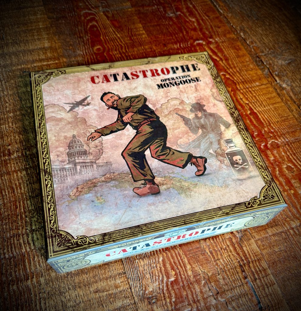
We recently partnered with Whippin’ 8 Games to create the illustrative artwork for their new board game, CATASTROPHE: Operation Mongoose.
Set in Cold War Cuba, the game draws on Operation Mongoose and the failed plots aimed at Fidel Castro. Players step into the roles of rival agents caught in a mission defined by secrecy, sabotage, bad decisions and shifting blame.
That mix of history and dark comedy shaped the visual direction.
The artwork needed to feel grounded in the period while still reflecting the game’s satirical tone. We looked to vintage adventure comics, pulp espionage covers, classified documents, political thrillers and mid-century print illustration.
For the box art, Fidel Castro stands at the center of the chaos as danger closes in from every direction. Aircraft, armed agents, poison and the streets of Havana all point to a plan already coming apart.
The goal was to capture the tension between the seriousness of the historical setting and the absurdity of the operations themselves. CATASTROPHE turns that contradiction into a competitive tabletop experience built around plotting, sabotage and self-preservation.
CATASTROPHE: Operation Mongoose is coming soon from Whippin’ 8 Games.
Follow them for launch updates, gameplay reveals and further instructions from Head Office.
The mission will fail. Make sure it’s not your fault.
Monster on the Ice: The Adrenaline Yeti Jersey is Real
By Dave Waite • July 10, 2026
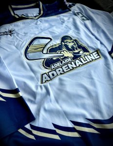
Big big thanks to our friend Glen Foll for having this custom Adelaide Adrenaline hockey jersey made up for us.
Zookeeper loved creating the Adrenaline Sasquatch logo…seeing it stitched onto a sweater like this is a pretty special feeling.
Character design is one of those places where strategy, personality and pure visual attitude all have to click at once. A super memorable mascot needs to feel like it belongs to the team before it ever hits the ice.
This Yeti definitely brings the energy and has been a huge hit Down Under. 🏒
New Motion Design Video for Pioneer Bank
By Dave Waite • January 26, 2026
Zookeeper partnered with Boyd to bring Pioneer Bank’s Imagine Your Impact internal campaign to life through bold, high-energy motion design. Built around vibrant brand color, kinetic typography and dynamic movement, the video delivers real launch excitement while reinforcing a simple message: it starts with YOU. The result is a modern, motivating piece designed to strengthen employee connection, spark collaboration and support a one-team mindset across the organization. Pioneer Bank’s VP of Marketing and Communication shared: “This is incredible! You guys totally hit the nail on the head with this one and I can’t wait to share it.”
A Cinematic Journey Through the World’s Most Iconic Film Locations
By Dave Waite • January 8, 2026
Film has always shaped how we imagine the world. Sam’s Reel World Adventures turns that idea into a living, breathing experience.
Created and hosted by actor and director Sam Coale, the channel is a cinematic travel series that explores the real-world locations behind some of the most influential films and television shows ever made. Each episode takes viewers beyond the screen and into the environments where stories were born…streets, landscapes and landmarks that helped define modern visual culture.
The identity reflects that ambition. The opening title sequence was designed to feel less like a YouTube intro and more like the opening moments of a feature film. Weathered, stacked custom typography evokes classic cinema marquees, while illustrated mountain silhouettes anchor the mark in timeless adventure. A rotating film reel doubles as a compass. Its cardinal points subtly guiding the journey, while stars, drifting fog and atmospheric lighting build a sense of scale and mystery. Everything moves in deliberate, cinematic rhythm, setting the tone before the first frame of footage even appears.
This isn’t content designed for quick consumption. It’s a carefully authored series for film lovers, travelers and visual storytellers who care about place, history and craft. Each destination is treated with respect, context and curiosity…examined not just as a backdrop, but as an essential collaborator in the storytelling process.
Sam’s Reel World Adventures positions travel as a form of film scholarship and exploration as a creative act. It’s a channel built for viewers who want to see the world through the lens of cinema. And understand how real locations continue to shape the stories that move us.
“LOVE the animation! Amazing!! Tonally perfect too! Awesome AWESOME job!!! The fog/mist element really adds to it too! Excellent!”
—Sam Coale, Director
Original Art Is the New Luxury Signal
By Dave Waite • January 7, 2026
We’re back from break and saw plenty of inspirational over the break. And we noticed a trend. True art communicates craftsmanship, credibility and status. While AI slop soullessly races to the cellar and makes brands look cheap, brands that want to truly differentiate themselves commission original art. Real art makes brands appear luxurious, prestigious and desired.
This year had…character
By Dave Waite • December 19, 2025
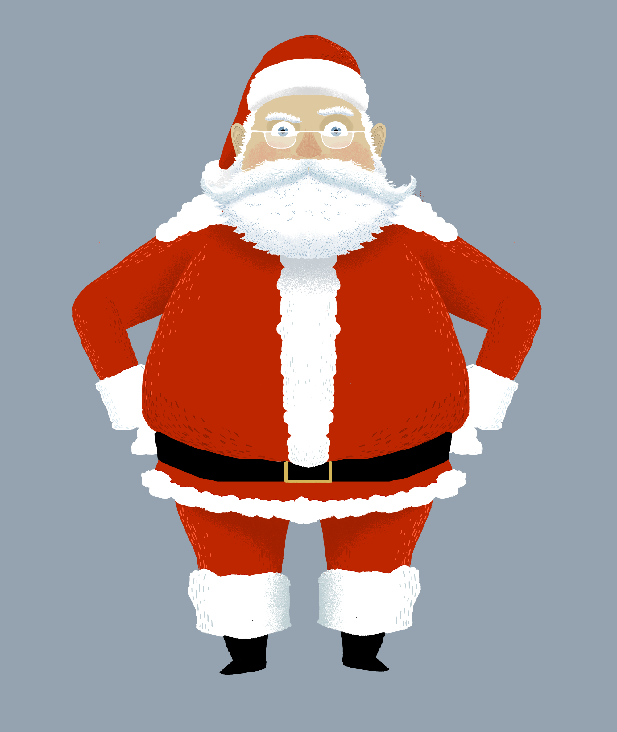
A Character Can Say What We’re All Feeling.
It’s been a year.
Even Santa’s feeling it.
Before we all step away, reset the pace and let the noise quiet down, we just wanted to say thank you for being part of our world this year.
We hope the holidays bring you a bit of rest, a few good moments of levity, and the space to reconnect with what matters most.
Wishing you a calm close to the year—and a New Year full of stories worth telling.
 Let's make some noise together
TAP THE GLASS
WE DARE YOU.
Hello@Zookeeper.com
Or call the Zoo hotline at 323-652-2887
 Be in the know
Join Our
Newsletter
We’ll alert you to our freshest work and give a behind-the-scene look at how it came together.