Embracing a tagline reading “We Are Talent,” The Hobel Agency of Beverly Hills represents a new breed of directors, writers and actors. The emerging talent agency called upon us to cast their first brand identity. With strong yet contorting mesh letterforms to symbolize how their agents deftly navigate Hollywood’s power circles, the logo strikes a modern pose that’s focused on the future.
Driving change in conventional wisdom, CounterFlow Solutions focuses on strategic consulting in the transportation industry. Applying artificial intelligence for breakthrough actionable insights, the Dallas-based firm anticipates where trends are going while leading their clients to a brighter future. Utilizing chevrons to represent authority and a systemic approach, their new brand identity represents multiple directions and angles set in motion, with the top green logotype guiding the way to go.
SoundMind Creative Group was founded in 2021 by a trio of entertainment industry executives to shine a light on important issues, with their first documentary, Follow the Science, slated for release in early in 2023. We designed and animated the logo with rays of light beaming up from the center and changing color to reflect the production company’s desire to change outlooks with their documentaries.
In the exploding universe of podcasts, Noisy Neighbors ranks as one of the top for soccer/football. Zookeeper created the illustrated mugs of Joey and Mulv, capturing the likeness of the uproarious, hilarious hosts of the Manchester City pod. The vibrating sound waves emanating from both character illustrations also double as an ode to Manchester’s music history.
The stunning amount of innovation in cryptocurrencies and blockchain technologies can leave you spinning. Designed for individual freedom, BankX aims to turn the industry on its head by being the first cryptocurrency to pay you interest for minting a stablecoin. We customized a bold, clean typeface to inspire instant trust, then multiplied the X for a dynamic, forward-thrusting mark.
Lockbox was engineered to be the first private network to store private keys and cryptocurrency wallets eliminating having to use the Internet to transfer or store any crucial personal data. We crafted a hexagon-shaped logo with a lock inside to reflect the tech company’s focus on innovation and security. The mark also has optical duality, able to be seen as either 2D or 3D.
The owner of this food products start-up company wanted an identity to reflect the charm and ambience of his family’s farm, set in amongst the idyllic rolling hills of Barnet, a small town in northern Vermont. We imagined an illustration of peak fall foliage centering a barn and silos, all to stand out on jar labels and marketing packaging.
The Loyalty Group, a consultancy based in Los Angeles, helps corporate clients navigate the maze of opportunities and challenges that they face in the world today. We designed their new identity to be approachable and personable, while symbolizing their expertise to solve complex problems.
A documentary soon on Amazon Prime,“Soccer in the City” explores the complicated relationship between soccer in America and its inner cities. Read our case study on creating the logo, opening animation and motion graphics for this important feature film.
A medical device company located in Denver, Colorado, Sana Surgical enlisted Zookeeper to create their first logo. The color-coded brand mark is based on an ancient symbol of healing. Paired with precise and clean geometric typefaces, the icon represents the innovative company’s four distinct product offerings.
Intended to be much more than an apparel line, dEATroitLOCAL is a charitable project hoping to strike out hunger in Detroit by giving proceeds of sales to feeding people. A veteran of the food and beverage industry and originally from Michigan, Paul Cerrito founded dEATroitLOCAL to be a movement and solution to an omnipresent issue that still plagues the city.
With the type in two colors to spell out EAT LOCAL within the name, the identity revolves around the circle mark (or dinner plate) formed by forks coming together, and also be representative of a spoked wheel, symbolizing Detroit’s proud motoring history.
A men’s health company, Joyful Jack’s needed an enthusiastic, upbeat logo. We illustrated several iterations of the lumberjack mascot with a thumbs-up attitude, wide eyes and big smile. The customized type arches over the character design, while the colors bring home the positive vibes of the brand.
After leading Vacancy through an intense strategy session to discover the heart of the brand, we created
the identity for the new apparel company to connect with their customer by engaging in provocative messaging and spark conversations. Read our case study about how we created the logo and built the brand.
–Eddy Muñoz, Vacancy Apparel
The Vacancy hole-in-the-heart logo was designed part of the identity system for the apparel company. Read the entire case study for Vacancy.
Read about our identity design for this TV and movie production company in the HummingDream Productions case study.
Founded in Louisiana, Highland Motorcars exquisitely restores historic, high-end automobiles to mint condition. Desiring an identity to match the level of craftsmanship they put into their work, Highland enlisted Zookeeper to create their revamped logo. We designed an inspiring mark to be reminiscent of a vintage hood ornament and crafted the customized typeface to reflect the feel of classic 1970s European luxury sports cars.
ConnectX is a new satellite company that launches small satellites with impressive storage capacities using the highest levels of security. Bitcoin wallets, sensitive corporate information and top-secret government files would be stored securely ‘off-planet.’
The customized typography of the logotype features the Ns not touching to draw visual attention. The logo marks the spot with orbits crossing to form an X.
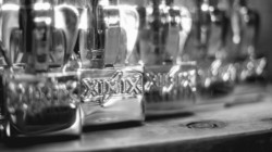
Launching in 2017, this L.A.-based start-up brewery will be located close to LAX and aerospace companies like Elon Musk’s SpaceX.
Leading the ownership team through an extensive strategy session, we discovered the brewery’s brand attributes and created customer personas, which we’d be gearing the design and marketing toward.
But first we needed a name, an increasingly difficult task in the saturated craft beer industry. We came up with dozens of selections. The name Ximix, a made-up word with a “space-y” feel, emerged as the winner. Instead of calling it the generic “craft brewery,” we wanted to keep the theme going, calling it a “Craft Exploration Company.”
We then imagined this explorer character holding a keg, an adventurer who would go to the ends of the galaxy to find the unique beer ingredients that would put Ximix on the map. He would be the Han Solo of the brewing industry. To finish up the identity, we crafted the customized type and gave the star an orbital swirl.
While it’s true the number of craft breweries in the greater Los Angeles area lags behind other major cities in the U.S., Southern California is in the midst of catching up fast. The ownership team of this start-up craft brewery, which will be located in the South Bay, approached us in early 2016 to create their identity for its opening.
After an extensive discovery session, Zookeeper created the logo after four rounds of identity design, crafting the logotype with hand-drawn, custom lettering to have an old-world, brewed-by-monks feel.
This brewery has since changed its name but we’re still very much involved in its branding, interior and exterior design, digital and social campaigns and branding work.
Read our case study on the branding of StormBreaker Brewing.
–Dan Malech, StormBreaker Brewing
Benson Marketing Group provides custom printing solutions to retail stores across the country, delivering hundreds of unique products that include bags, labels and tags. While focusing on country stores that sell folk art and antiques, Benson Marketing Group sought a new brand identity that would allow them flexibility in the future as they expand their business to serve a wider umbrella of stores, while appealing to a largely female client base.
Brainstorming and pondering many possibilities, we wanted to create a logo that symbolized the delight a customer would feel when leaving a store with a gift or new find. Zookeeper created a custom illustration of a ribbon, with a playful swirl, and colored it red to pop with excitement.
**We’re pleased to announce that Logo Lounge selected the logo we produced for Benson Marketing Group to be in their new book, Logo Lounge Volume 6, published in February 2011. This brand identity was selected by an international panel of judges in an “incredibly competitive judging session with over 34,000 logos entered.”
Read our extensive case study about the design of this Southern California retailer’s custom, hand-lettered logotype.
–Lawrence Tanenbaum, President and CEO, Kinsley
A health and wellness company based in Los Angeles, Mineral Power wanted a complete makeover of their logo. After an extensive discovery session, we created a vibrant, energetic identity.
After customize the the logotype, we designed a mineral-like crystalized effect with glowing, textured lettering. It’s an identity filled with life and energy, promising a better, healthier future.
The LifeBalance Program offers discounted products and services that allow companies and organizations to help employees and members balance work with fun to live their best life. The Portland-based company’s message is one of health, wellness and personal fulfillment.
LifeBalance’s management team enlisted us to makeover the brand and create an extensive brand standards manual. With a vibrant sun, rolling hills and streaming river, the shape of the brandmark is a cross between a guitar pick and digital map marker. The overall effect is intended to be bright, energetic and positive, reflecting the optimistic nature of the brand.
–Bill Bahrenburg, The LifeBalance Program
With the idea of being be a modern, sport-specific gym for elite hockey and lacrosse players, the Portland, Oregon-based ownership of this start-up fitness facility approached us to create its name, branding and develop the website.
After an extensive naming convention, The Train Station was chosen. The logotype was custom-created to resemble rail tracks. Crossed barbells form a mark inside the bold, on-rushing train.
–Matt Bader, The Train Station
After an insightful discovery session, we embarked on the brand identity process for Fire Bowl, a new restaurant in Los Angeles that opened in late 2015. Round 1 narrowed the focus down from a dragon or Asian-themed logo to a literal bowl on fire. The type was crafted from scratch, chiseled along the edges to look weathered. The mark in the middle is custom-illustrated.
We also created the restaurant’s signage, designed the menus and consulted on its retail design.
–Robert Lee, Fire Bowl
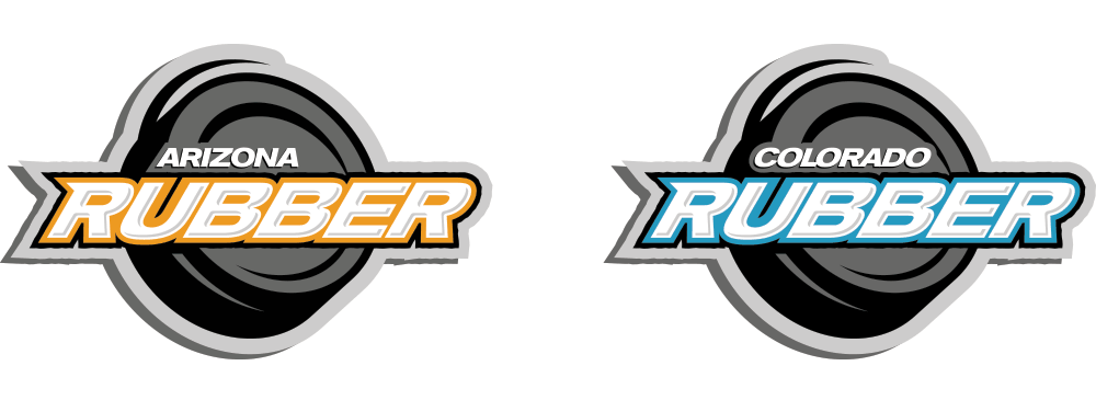
Hockey has grown like wildfire in the western U.S. since the 1990s, and Good Sport Media documents it all, from youth to professional ice and roller hockey in California, Nevada, Arizona and Colorado. We redesigned each of their logos, customizing the type, creating the swirling, energized puck behind the type and giving each state a specific color palette to work from.
In addition to crafting their new identity, Zookeeper designed their branding materials, developed their websites and revamped their print publications.
A trade school based in downtown Los Angeles, the Film Connection requested that we reimagine their logo. First, we selected a geometric, sans serif font and customized it by moving the Ns together to emphasize connection. We then concepted and created a mark using the F and a backward C to form the part of movie projector where the film threads and loops through the feed sprocket.
Read more about our work for the Film Connection.
–Mike Keesling, The Film Connection
Gold, Jerry, gold. In the music business, gold symbolizes success. Charged with creating the new identity for the Recording Connection of downtown Los Angeles, we designed an abstracted mark to resemble the lines of a record player with modern angles. As in the Film Connection logotype, the Ns in Connection are brought together to emphasize the networking possibilities of the trade school.
Read more about our design and branding work with the Recording Connection.
–Brian Kraft, The Recording Connection
After creating the new name for this Los Angeles-based kids clothing company, we imagined the Apparel Monster. An illustrated creature threaded together with a zipper neck and button head to be imaginative, fun and playful. More whimsical than scary, the Majicco logo serves as the flag for the stylish, European-influenced brand that’s taking a hip and cutting-edge approach with its fashion designs for kids.
We customized a classic font, tweaking it to be youthful and infusing it with an attitude of play, and the two o’s combined to symbolize childhood stretching to infinity. The uncommon gold and silver coloring is intended to make an immediate, bold impression.
We didn’t just start imagining a new identity for Modern. Since we first began working together in 2010, we’ve had our mind on the horizon. Where should the brand evolve to? A family-run business since 1971, there were some existing sentimental ties to the old logo.
The previous logo proved to be a challenge with its different colors depending on the file, no brand standards and a variety of different fonts employed for the tagline. The mark itself was made to look like a simplified house that doesn’t accurately reflect the wide variety of modular building products that Modern makes. The Serpentine typeface is what we call in the industry “Font out-of-the box,” which means it hadn’t been customized and anyone could download the font for free simply type Modern’s name to easily recreate the logo.
We strategized that the new identity should look modern. It should be dynamic. It should clearly reflect Modern’s history, yet pave the way for an expansive future.
We wanted to create a completely custom mark with handcrafted type with a fresh color palette. And a bold optimistic appearance. We wanted to make the word Modern the dominant visual takeaway, with Building Systems still present but less prominent. We wanted to put the focus on the Mod since Modern makes modular buildings. And we aimed to create a mark that could stand alone if need be to represent Modern’s evolution.
We also didn’t want to completely do away with the old identity, but take some selected elements to move forward with. We wanted to emphasize strength, stability, flexibility, mobility, craftsmanship…and environmental-friendliness.
Bold. Original. Well-Constructed.
Modern’s new identity makes a memorable impact with a from-scratch capital M. Its twin peaks rise up and move in a diagonal direction to convey optimism. It’s an M that can easily stand alone and serve as a distinct mark on the front of a Modern truck or stamped on a piece of wood. It’s an M that can be enlarged and form a pattern for backgrounds. And of course, the M hints at a modular structure rising.
Strong yet Approachable.
The Outage typeface we selected after pouring over dozens of options was completely customized for Modern. Every letter has been heavily tweaked, modified and smoothed to be strong yet approachable. The Building Systems is Unvers Light, a no-nonsense sans serif font that’s a timeless favorite of ours. It too was modified to be slightly bolder yet not overwhelm Modern, which was intended to be the primary takeaway of the identity along with the M.
Going Green.
Then we added color. The old identity used a dark blue. But since Modern is focused on being green and that now being a big selling point, why not truly be green? This bright green was chosen for its vibrancy and life. Modern’s new flag is a dynamic way to smartly head into the future with confidence. To increase emotional connections with customers. And to forge new perceptions that will lead to increased sales.
The Decadent Moose prides itself on being a snarky, sassy blog dedicated to covering the Stanley Cup Champion Chicago Blackhawks and all things hockey.
Zookeeper helped name The Decadent Moose, then brainstormed on what would make for an unforgettable brand impression. We created a fun, memorable identity that’s a cross between Bullwinkle and Dean Martin wearing a lampshade as a hat.
Screaming eagles. Demonic clowns. Saintly angels. Artist Matt Andrews sends them down the road in serious style. He imagines and then paints inspiring images on bikes, trucks and cars. He came to us seeking a brand identity for his new airbrush studio named Hypnotic Air. We created this logo to reflect the energy and impact of his impressive painting style.
The custom-illustrated swirl draws the eye in and doesn’t let go. The type was heavily altered to have a unique feel. We also worked to give the logo a sense of depth and dimension. Just don’t stare too long or you will get very sleepy…
–Matt Andrews, Hypnotic Air
A management consulting firm in Portland and Bend, Oregon, The Gunter Group called upon Zookeeper to create their brand identity. We created this G mark with an arrow to spark visual interest and serve as a forward-aiming symbol of their future direction.
We’ve also been enlisted by Gunter over the last few years to lead an extensive strategy session, consult on future marketing directions, design their stationery system, develop their website and create advertising campaigns.
After branding and launching the new website for their sister company TargetClose, the DuMont Project approached us to revamp their logo and create a new site for their branded response marketing consultancy.
The DuMont Project features an integrated mark with the P inside the D, symbolizing the high-tech company’s ability to deliver integrated results in direct-to-consumer marketing.
We also designed an extensive system of icons for the tech company.
Chomp! Celebrity chef James Berry enlisted Zookeeper to bring his new brand to life, making it fun and energetic to inspire healthy eating.
Based in Los Angeles, his company needed a name for his new health food products company. We brainstormed and came up with the memorable Grubble Grubble name. Wanting a brand inspired to make healthy food choices fun, we created the new logo and tagline to stand out and gain attention on food product labels. With a flavorful mix of organic foods, Grubble Grubble encourages people to eat a well-balanced diet for optimum health and clarity.
Zookeeper wanted to capture the fun and youthful attitude that the brand name embodies. The custom-crafted, heavily altered logotype was created with large, rounded, block letters, which we took a chomp out of the corner. Orange was selected to stimulate appetite and happiness, while radiating the warmth and energy of the company.
—James Berry, Grubble Grubble
Based in Los Angeles, Peter B Media produces a wide variety of entertainment and events, from music recordings to award shows. The company needed a new logo to reflect the excitement surrounding its programs and events.
Zookeeper set the type with the P and B to be dominant, with the middle letters all connecting. Placed on a black background for dramatic effect, the dynamic logotype was formed out of numerous points of light and then given a strobed effect to appear to glow.
***Our brand identity for Peter Be Media was selected for inclusion in the new Logo Lounge Masters Library Series book, “Typography and Enclosures” from Rockport Publishers published in 2011.
With uneven corners, splintering benches and more faulty faucets than hockey pucks, the 40-year-old Valley Ice Arena appeared run down. But to our eye, it looks great — an old barn loaded with character and personality. The Zookeeper-produced logo and tagline lends a gritty, fun feel that differentiated the rink from other brand-new but sterile arenas in the Portland, Oregon-metro region.
Zookeeper also created the tagline, “The Rink with character. And characters.”
***Our brand identity for the Valley Ice Arena was selected for inclusion in the new Logo Lounge Masters Library Series book, “Typography and Enclosures” from Rockport Publishers published in 2011.
Zookeeper directed the creation of the new logo and logotype for The Neighborhood Group, an emerging real-estate company in Oregon and Washington, to be welcoming and friendly, while exuding elegance and symbolizing trustworthiness. The clustering of homes and the upward arrow above the ‘i’ were designed to suggest the idea of community, movement and appreciation.
**We’re pleased to announce that Logo Lounge selected the logo we produced for The Neighborhood Group to be published in Logo Lounge 5, found in nearly every bookstore in the U.S. Over 33,000 logos were submitted for consideration and the final collection “is not only an excellent point-in-time examination, it is full to the brim with inspiration, higher thinking and craftsmanship.”
The travel video show, Walks of World, features inspirational explorations and adventures from around the world. We crafted and weathered the logo’s lettering to resemble an old-world map, with design details including landforms and a compass rose.
Located in West Hollywood in the shadow of the legendary Chateau Marmont, The Den of Hollywood wanted to rebrand the restaurant and bar with a fresh identity to signal their new ownership. Zookeeper was enlisted to take over The Den’s social media in late 2010, giving us unique insight into their customers and discovering a dedicated, hip core of regulars, many of whom work in the entertainment industry. With Pink Taco moving in across the street later in 2011, The Den’s management was willing to go with a new look that pushed the envelope.
We created an illustrated identity intended to surprise then endear, a magical unicorn with a mischievous mustache. The strong, bold logotype below was customized to be completely unique to The Den. Not taking itself too seriously, the logo symbolizes the fun times to be had at The Den, an unpretentious, favored hangout in the heart of L.A.
Centered around an outdoor fire pit on the patio and an inside fireplace, this alternate logo for The Den Of Hollywood focuses on fire and the unusual down-leading staircase at is entrance. Descending into a devilishly good time for the evening? Warmth, passion and fun light up this theme.
The logotype was created by hand to be completely original to reflect the eclectic cast of artistic characters that this West Hollywood restaurant and bar attracts. Entertainment types from the film, TV and music industries make up the bar’s core customers, with the occasional A-list celebrity thrown in for good measure.
The original Terminator endoskull. Daft Punk’s shiny helmets. Top-secret military satellites. From movie props to hush-hush Apple projects, Artcraft plates amazing applications with precision and innovation.
Returning to its visual roots of the original logo of the third-generation, family-run business, we reimagined the satellite mark to be retro yet futuristic. We gave the logotype a golden, gleaming finish to reflect the industrial company’s propensity to shine.
We also designed and developed their new website.
After naming and branding her original jewelry business, Minabea, Christie Schimpke introduced a new line of made-by-hand, upcycled jewelry created from European cars. Her husband, Dan Schimpke, runs Beverly Coachcraft, a high-end auto body shop for luxury cars in Los Angeles, so her supply of metal from crashed cars was nearly limitless.
We named the line “Crash,” which quickly zoomed in popularity and became Christi’s primary business. We created this stylized mark to reflect the lines coming together of an intersection. The customized type was smushed together to match the name. We also wrote the tagline, “Luxury. Reimagined.”
–Christie Schimpke, Crash Jewelry
Based in Chicago, Illinois, Lush Wine Events is a new start-up that hosts wine-tasting events, classes and workshops, teaching people to evaluate and taste wine like pro while learning about wine types, varietals, vineyards and regions. Lush wanted to be seen as wine experts, but not in an intimidating or snobbish way. Approachability was emphasized in the brief, as were opulence, luxuriousness and lavishness – topped with a sexy edge.
We came up with a concept that focused on movement with the swirl of wine about to splash out of the glass. Bold and attention-grabbing, the brand identity sports customized letterforms crafted to be refined and elegant. We illustrated the wine glass in an elegant grey and contrasted it with splashy, bright crimson to give a rich, lush look that makes a memorable impression.
Zookeeper also created the new business cards, stationery and website for Lush.
Our friend Melanie Harari came to us with a great idea for a new iPhone app – a free app that lets you set how often you should call your Mom and then reminds you at set times during the week. We went with a fun, lighthearted style that would appeal to daughters in their 20s and 30s.
Zookeeper crafted attention-grabbing, custom letters created from scratch. We illustrated a nagging Mom with a funky hairstyle, holding up her old-school, rotary-dial phone. The fun, humorous app is available for free download in the Apple iTunes store.
A global organizational consulting firm, Korn Ferry needed a logo for their legal department based in Los Angeles. We designed this original brand identity based on a stylized knight in chess to emphasize the smart, strategic thinking of the legal team.
Divorce is a difficult time for anyone. Clearview Divorce, a new online divorce resolution company, came to us in need of a new logo that conveys speed, simplicity and ease. People getting divorced want to move on. They want out quickly, without any added stress or hassles. And they want be able to soar again. They desire to have their freedom back. And a fresh start ahead.
Clearview’s founding tenet is that there is no reason to drag out a divorce with slow courts and expensive lawyers. The company offers a lower cost and more convenient alternative with a modern process and online, impartial arbitrators.
Zookeeper designed the logo that aims to be positive and aspirational. A fast-flying eagle serves as a perfect symbol as a powerful, freedom-loving bird with a clear vantage. An energetic, healing, lighter blue contrasts with a deep, dark, stable brown. The type was customized to reflect the illustration.
We created a full branding program for Clearview Divorce that included a new website with custom illustrations, eBook designs, stationery system and social media page designs.
Douglas Raub Design + Development specializes in high-end custom home construction. We created this logo to reflect the company’s commitment to exceptional, enduring construction. The mark’s smooth architectural lines were inspired by the craftsmanship of the firm’s recently completed showcase home, and was designed to subtly reference the D and R of the company’s initials. We chose the typeface to be bold, distinctive and spacious, the same feeling that’s invoked when entering one of the homes designed by Douglas Raub Design + Development.
Read our case study about the website we developed for Doug Raub featuring stunning photography and motion-design, SVG graphics.
Grab a bowl of courage before chowing down some Chainsaw Chili that’s tasty – and hotter than lit napalm. When Kolar Worldwide selected us to create the logo for their latest food product, we were excited to design a brand identity as tough as its name. First we illustrated chainsaw-wielding Rusty, the sturdy, reliable and oh-so-quirky mascot to appeal to their target audience.
Then we crafted the custom logotype. The colors, always important in food packaging, reflect the traditional red and brown colors of chili, with a hungry yellow splashed in. The result is an arresting brand identity sure to get your attention on your next walk down the grocery aisle.
Balloon Celebrations has been Los Angeles’ premier party planning corporate event company since 1981. The boutique shop employs a small army of balloon crafters and manipulators that can literally transform plastic helium into breathtaking works of art for any occasion.
We created their new logo using transparent circles of color that smartly come together to form a unique shape. We customized the typeface, which was chosen for its smooth curves and friendly personality. The result is a vibrant, fun logo that immediately conveys visually what the retail store does.
Zookeeper also wrote their new tagline, “The Art of Fun.”
Right now, things are going great for 3 Rivers Marine & Tackle, a premier fishing supply store located in the Pacific Northwest close to Seattle. The store is bustling. Business is growing. Expansion may be on the horizon. The fish are biting.
We created this new identity to set the course for an even more prosperous future. A professional look that makes customers take notice, puts fear into fish and helps sink the competition. Everyone at 3 Rivers knows and loves fishing – it’s an undeniable passion. If people at the store aren’t working, they’re fishing.
David Brownstein, founder of Hollywood Coaching, approached us for a new logo for his professional development business that caters to movie studios and entertainment executives. He desired a logo that would appeal to both companies and individuals, with a modern, fun feel. In the project kickoff meeting, David came wearing a black fedora and was brimming with ideas, sparking the concept that would become the final logo.
Zookeeper illustrated a custom iconic mark of an inspired fellow with creative thoughts bursting from underneath the hat. The fun logotype was customized and then filled with lights to symbolize ideas popping to life. The finished product is an identity embodied with excitement, energy and approachable sophistication, the same qualities Hollywood Coaching brings to its work.
Bomb your target. With deadly accuracy. Book A Golf Pro came to us to do just that with a brand new concept and fresh business idea of booking professional golf lessons online. This original idea allows people to book a golf pro as quickly, easily and cost-effectively as possible. The top of the line website is easy-to-use and can be used to book a golf lesson from anywhere in the country.
The client was open to suggestion and knew they wanted a creative, fun and eye-catching yet professional logo design. Zookeeper created an original tagline, as well as a creative and new school illustration. The design of the logo captures the true spirit and integrity of the game that people love about it. This straightforward and creative logotype is innovative and inspired by the high energy of the client. This is a new era of golf websites.
“The Hills.” The Super Bowl. The hottest network TV shows. The Final Four. Box office hits. The Academy Awards. The craziest car chases in LA. When the world’s biggest entertainment, sports or news companies need the best aerial photography and images, they call upon Airborne Images of Los Angeles. Shooting primarily from helicopter platforms, the growing company delivers exceptional aerial productions, helicopter services and photography for its clients.
Airborne Images called upon Zookeeper to re-imagine its brand identity. We created this new logo to reflect Airborne Images’ dynamic movement and speed, technical precision and innovative, cinematic eye.
Zookeeper also wrote the tagline for Airborne Images, “Captured From Above”.
Zookeeper rebranded The Beauty Box with a new logo design and then built its new e-commerce website to be responsively design to instantly adapt to whatever screen a customer views it on, whether it’s an iPhone, iPad or computer screen. With over 5,000 products, The Beauty Box website featured a collection of exclusive, sought-after indie brands that can’t be found anywhere else.
BodyBlast, located in Crystal, MN, specializes in being a circuit fitness studio for women, but also has dance, group fitness and personal training for children, teen, adult and senior men and women. The fitness studio has a warm, welcoming feel with a real sense of community. Women have been known to stay long after their classes have ended to have coffee and talk.
With all this in mind, the client was in need of a sophisticated logo design that showed that inviting and non-threatening vibe and still popped with strength and boldness. Opening up office space in a location that had been vacant for two years, they needed the logo to be eye-catching and attention-grabbing. The colors capture the spirituality, trustworthiness and sincerity of the community while still being upbeat, fun and energetic.
A cutting-edge stylist located on trendy Robertson Boulevard in Beverly Hills, California, April Tomi was seeking to reinvigorate her brand in a hyper-competitive, fickle marketplace. We created the new brand identity for her business from scratch, turning the A in her name into a blow dryer and crafting the other letters in a script type to serve as a cord and plug. The letters were completely hand-drawn and not based on any existing type to reflect the originality she uses to create every one of her hair stylings.
With a history that stretches 30 years, Laserod is focused on lasers, which includes micro-machining, drilling holes, cutting, etching, pattering and creating touch-screen displays. Based in Torrance, California, the tech company is poised to head into the nano world where a powerful microscope is needed to see the results. Theses lasers create tiny little holes, thinner than a hair that can get down to a spot size of 5 microns, as the market moves smaller and smaller in size. Laserod was seeking to capture significant marketshare and wanted to get their job shop to a crescendo, with more shifts and capacity, to be the biggest company in the world in that area.
Laserod contracted us to create a new brand identity and website. After brainstorming and sketching away, we selected an italic, sans serif font for the logo to convey a sense of movement and action. Thin, horizontal lines shoot behind the white block letters to demonstrate quickness, energy and laser-like precision. The green and blue stripes were chosen to convey liveliness, strength and stability. The new identity symbolizes the company’s high-tech, responsive and precise qualities.
Zookeeper also created the tagline, “A Passion for Precision.”
The Oregon West Hockey League contacted us to create a brand identity for their new hockey league. Using the metaphor of an owl in the OWHL acronym, we designed this logo to emphasize flight and movement, while using colors that reflected the Pacific Northwest.