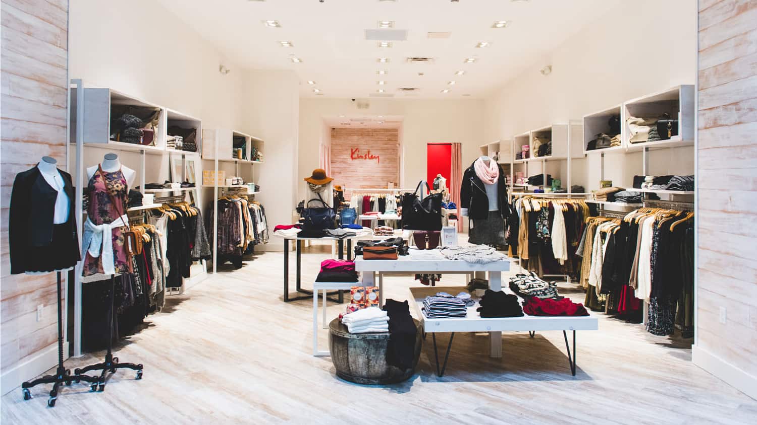
Established by a leadership team with a proven track record of retail franchise successes, Kinsley approached us seeking a corporate brand identity for its new series of women’s apparel stores. After a discovery session and extensive research, we worked with the client to cement the vision for the shops.
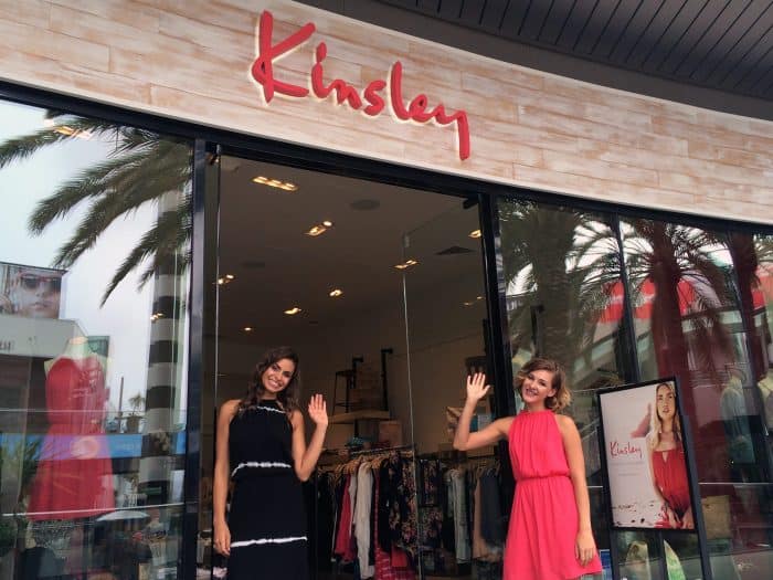
With a casual California vibe, Kinsley wanted the stores to be positioned as approachable boutiques for millennials to find familiar favorites and discover new ones. A Kinsley store was to feature unique pieces and inspired style, a special shopping destination for women in their 20s and 30s.
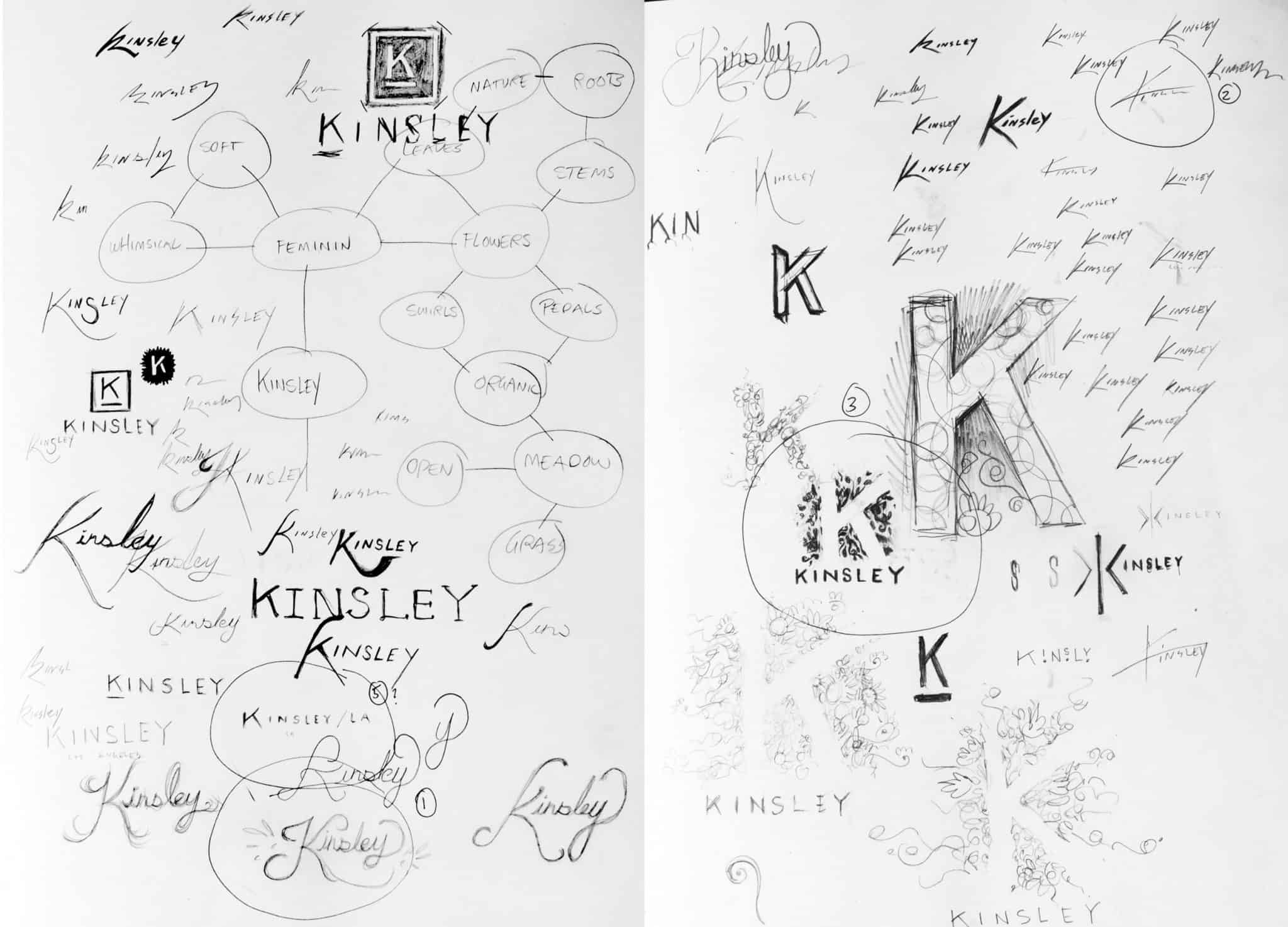
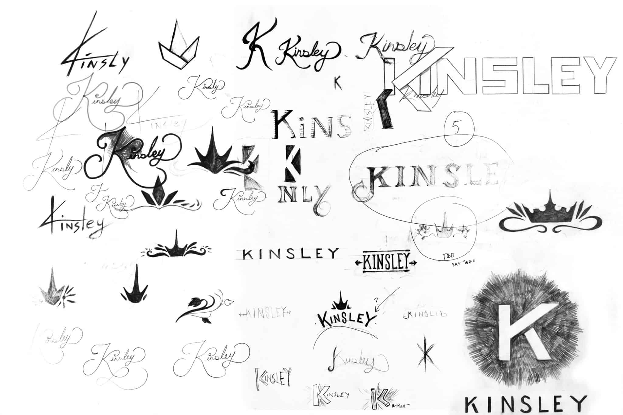
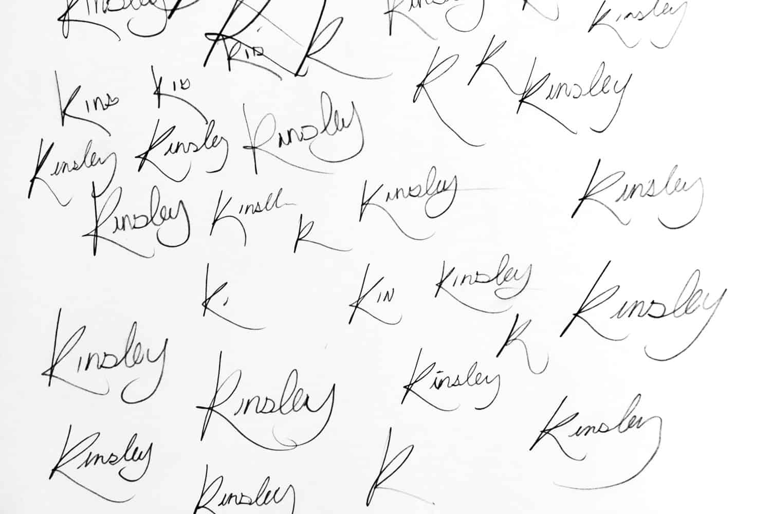
Round 1 of our identity design process is all about the big idea—what will resonate with customers, make a logo stick and prove memorable. We start by drawing pages and pages of ideas in our sketchbooks.
The name Kinsley orginally meant the “King’s Meadow.” The final result needed to be an identity that was both regal yet approachable, the flag for a special brand. Brainstorming for an identity that embodied timeless, classical beauty in a clean, but not overly feminine way, took time and plenty of ideation.
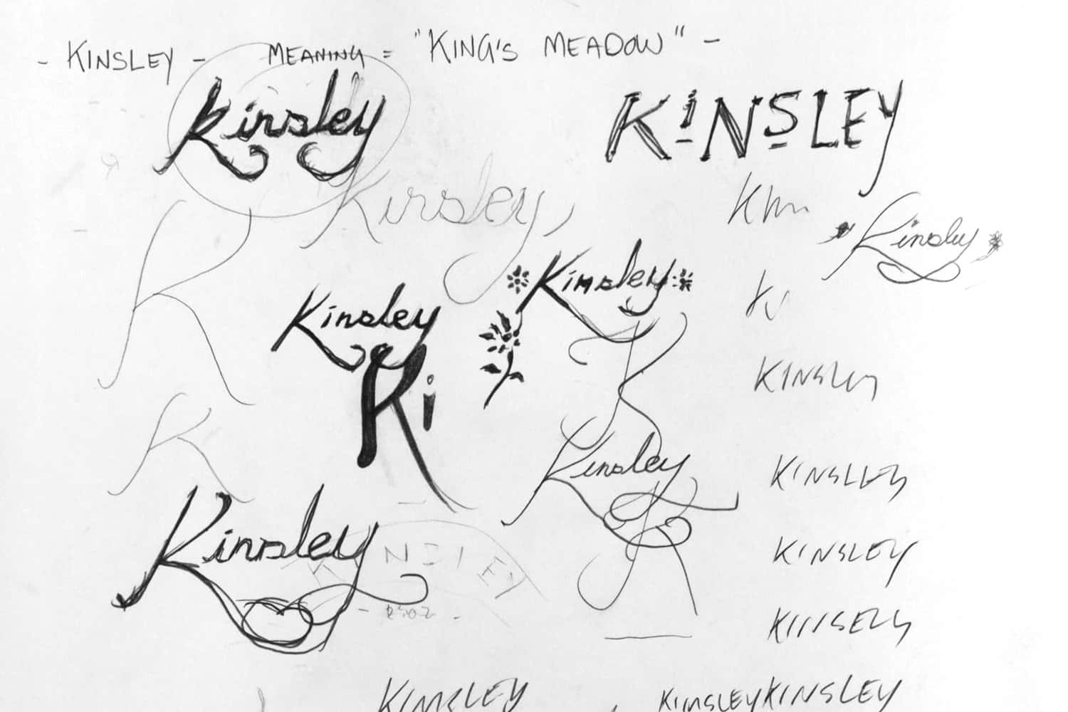
With an organic feel, this patterned identity was selected as an early favorite. It had the potential to be adaptable, flexible and symbolize growth. Initially the client liked this direction, but then another concept emerged…
The idea of using a signature for the new identity was chosen after much review. But it couldn’t be just any signature. It had to smooth, approachable and inviting.
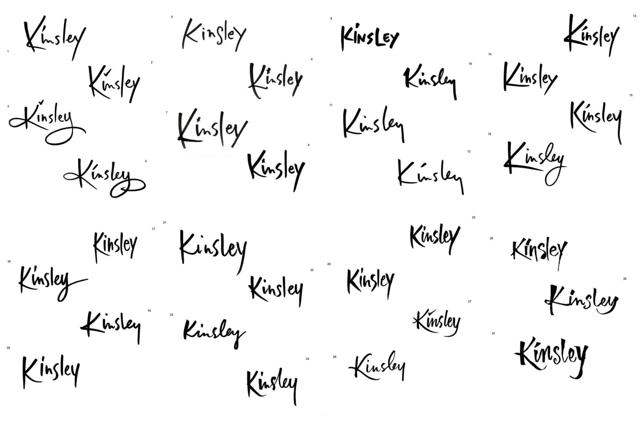
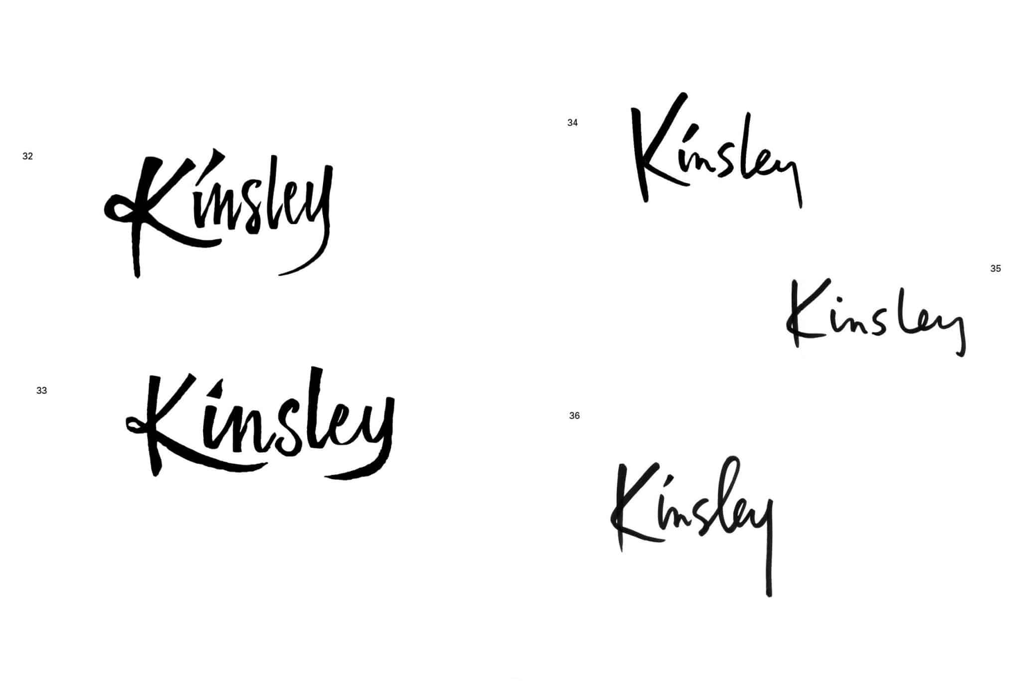
With the direction decided, we brought on one of the world’s best custom letterers to create a handwritten, utterly unique cursive signature.
Our designer provided over three dozens options for the custom calligraphy. Kinsley gravitated toward a lighter, elegant rendering that was made to appear open and casual, but not quite whimsical. A signature that everyone wants to be friends with—and invited to their party. No detail was overlooked, including the spacing and dot above the i.
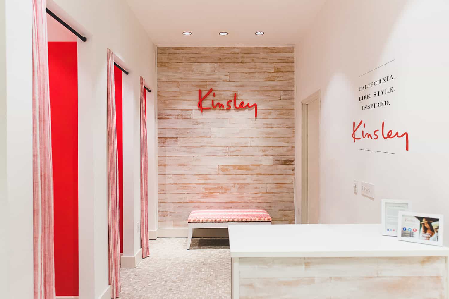
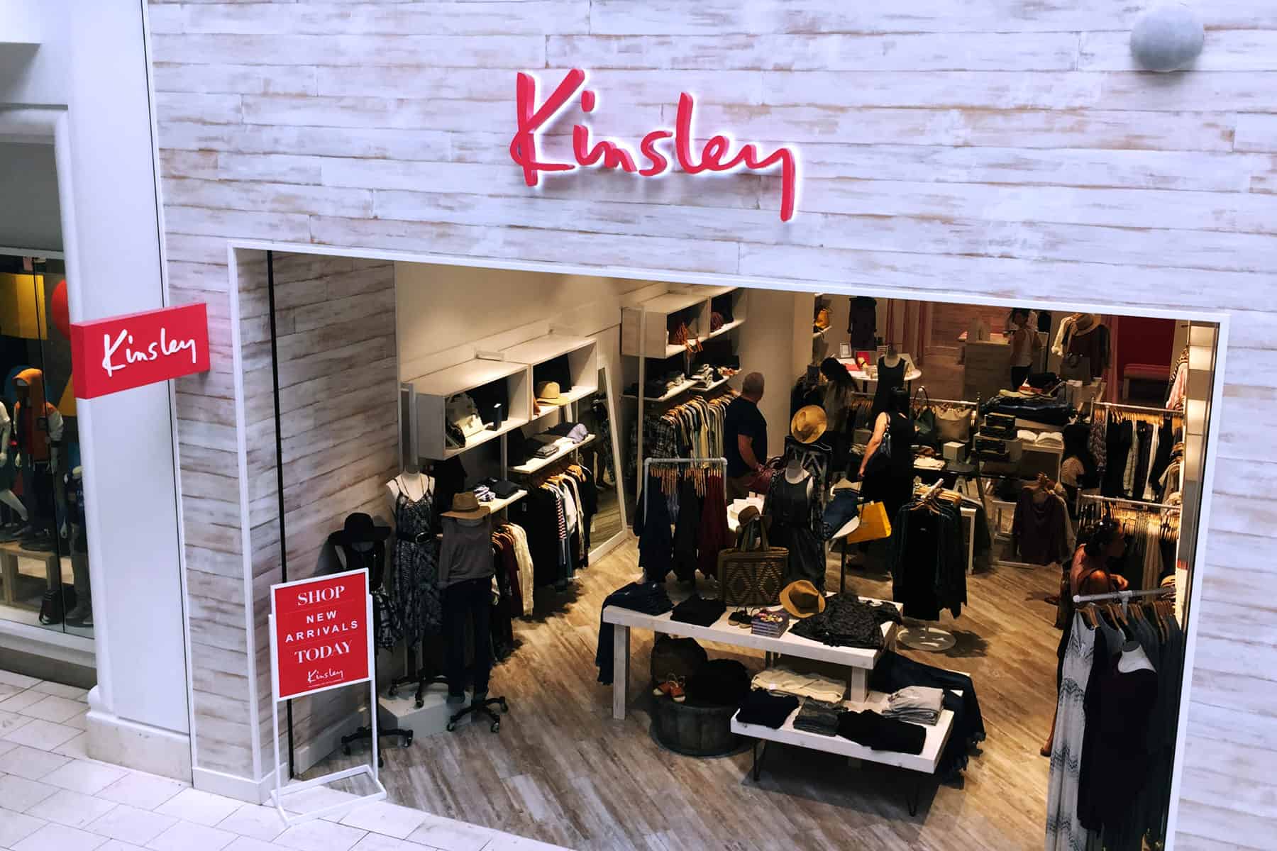
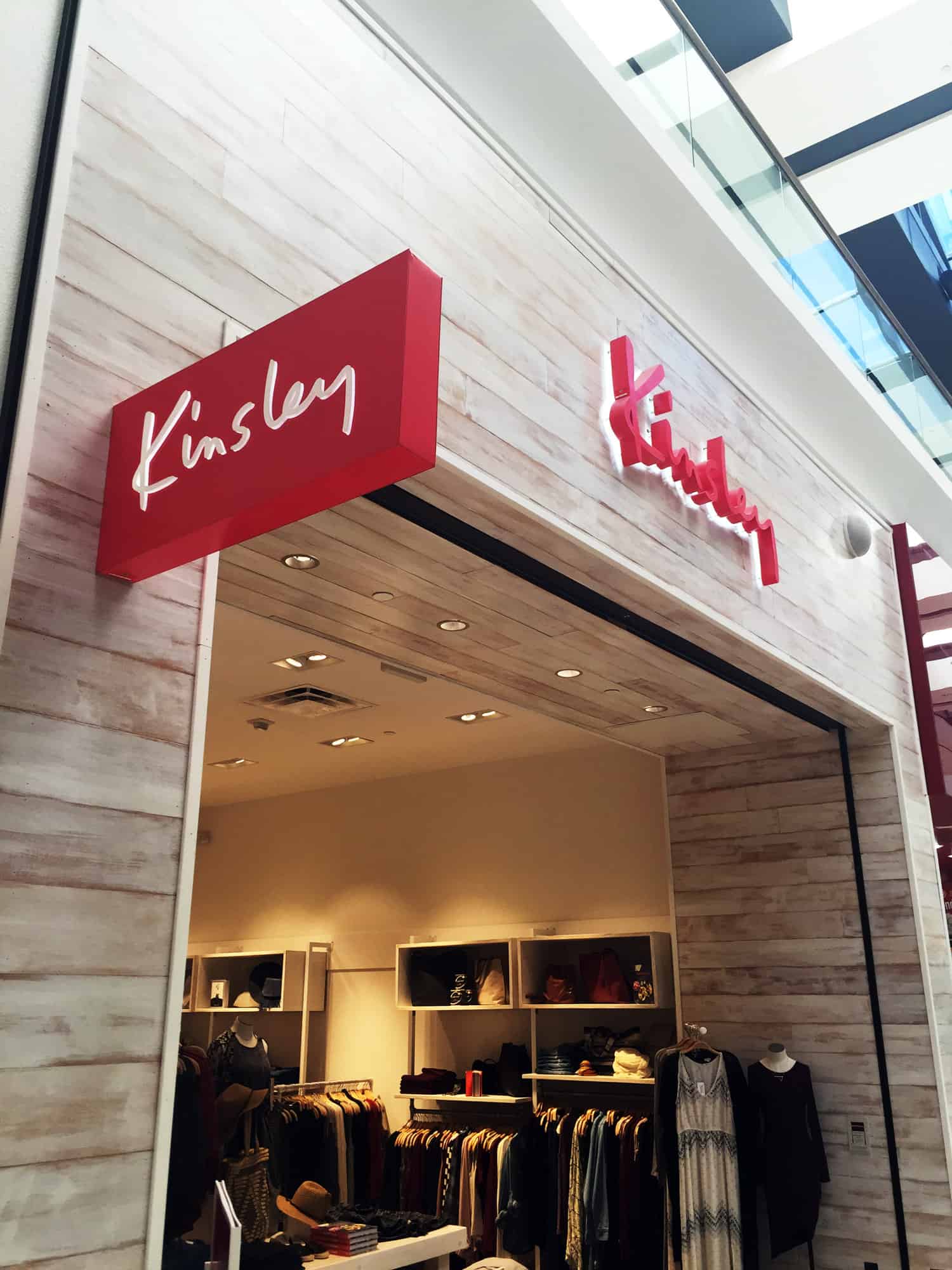
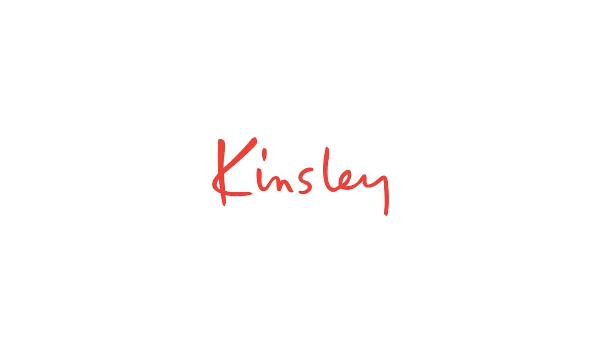
We splashed the bespoke logotype an energetic red, with signage highlighted by white backlighting to make it come alive with a refreshing, clean glow. The brand launched, with three store openings to start. Soon, Kinsley will have its first store outside of SoCal in upscale Scottsdale, Arizona, with more on the horizon.
–Lawrence Tanenbaum, President and CEO, Kinsley
 ;
;
