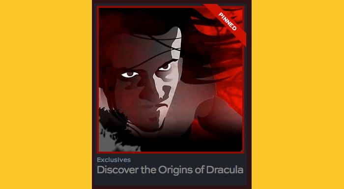
After the success of our six Revolution animated webisodes, NBC Universal rang again, re-enlisting us to create five new episodes for their first-year TV show, Dracula from Britain’s Carnival Films, producers of Downtwn Abbey. Wanting to create interest online and through social media, NBC came up with the idea of tracing the origins of the re-imagined Dracula story, based on Bram Stoker’s novel. The webisodes appeared on NBC.com in the US and SkyTV.com in the UK.
To start sketching, all we had to go on was the first, top-secret episode of Dracula, which was to first air in two months, and the scripts of the webisodes that were all written by the show’s creator, Cole Haddon. The rest was up to us.
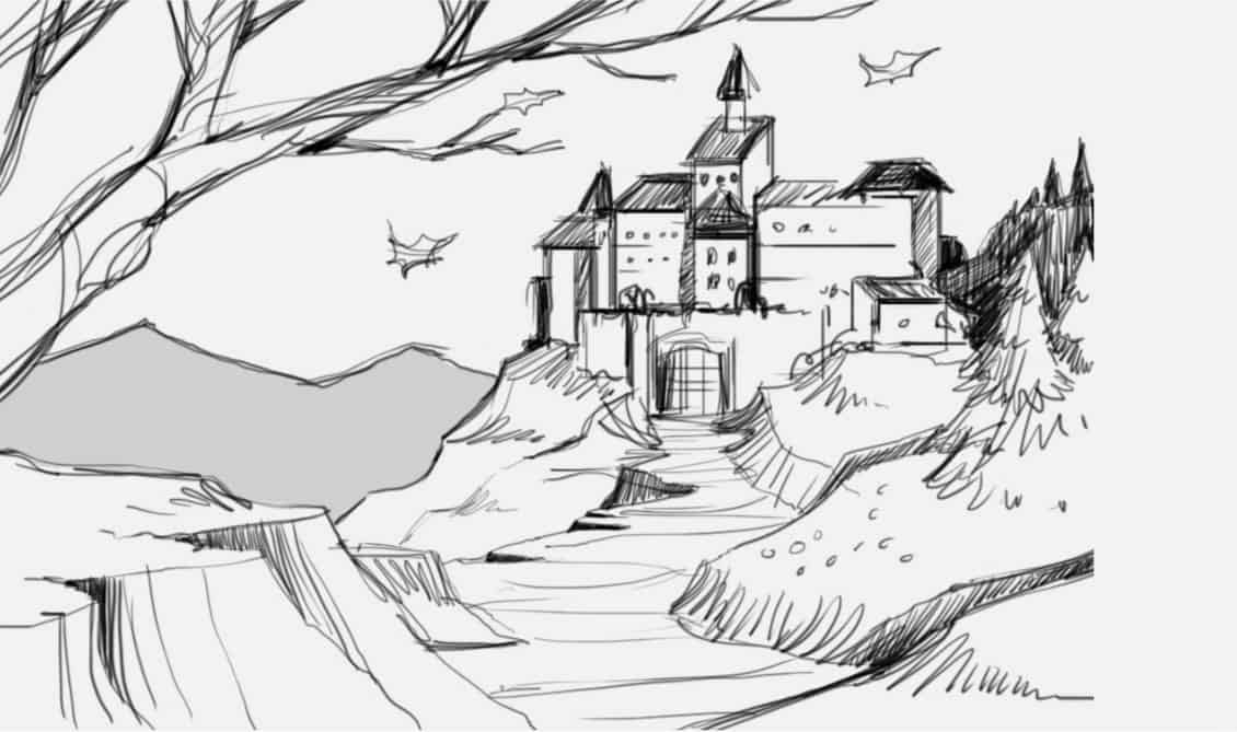
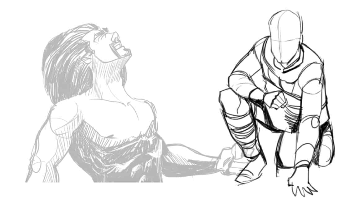
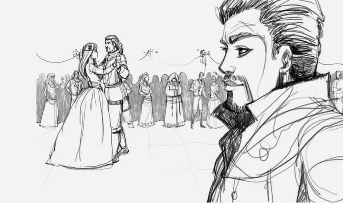
NBC sent over some reference material. We then dug in and did our own research on the legend of Vlad the Impaler, and 14th-century Transylvania and Romanian castles. We began sketching the main figures in the scripts, developing the look, feel and mannerisms of the characters.
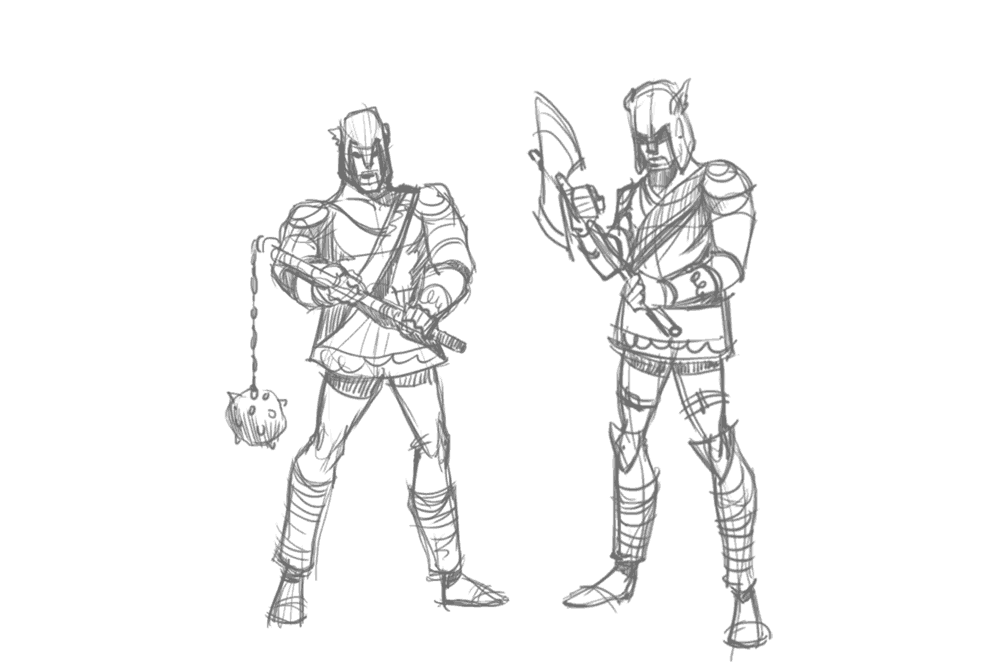
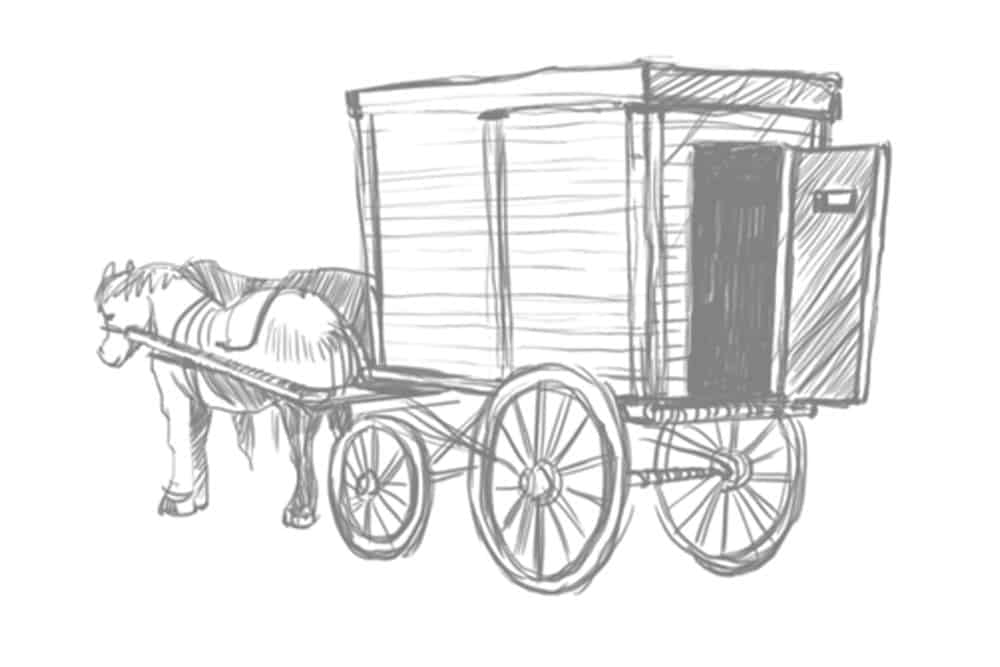
On the Revolution project, we had just one illustrator working on the storyboards. With even tighter deadlines for this go-round, we brought in an additional top-notch artist to help out. Before we started rendering any final art, we finished all five of the storyboard series with over 20 sketches each.
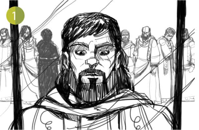
Needing dozens upon dozens of scenes, we cranked away on the illustrations, refining ideas from the storyboards and bringing the characters to life.
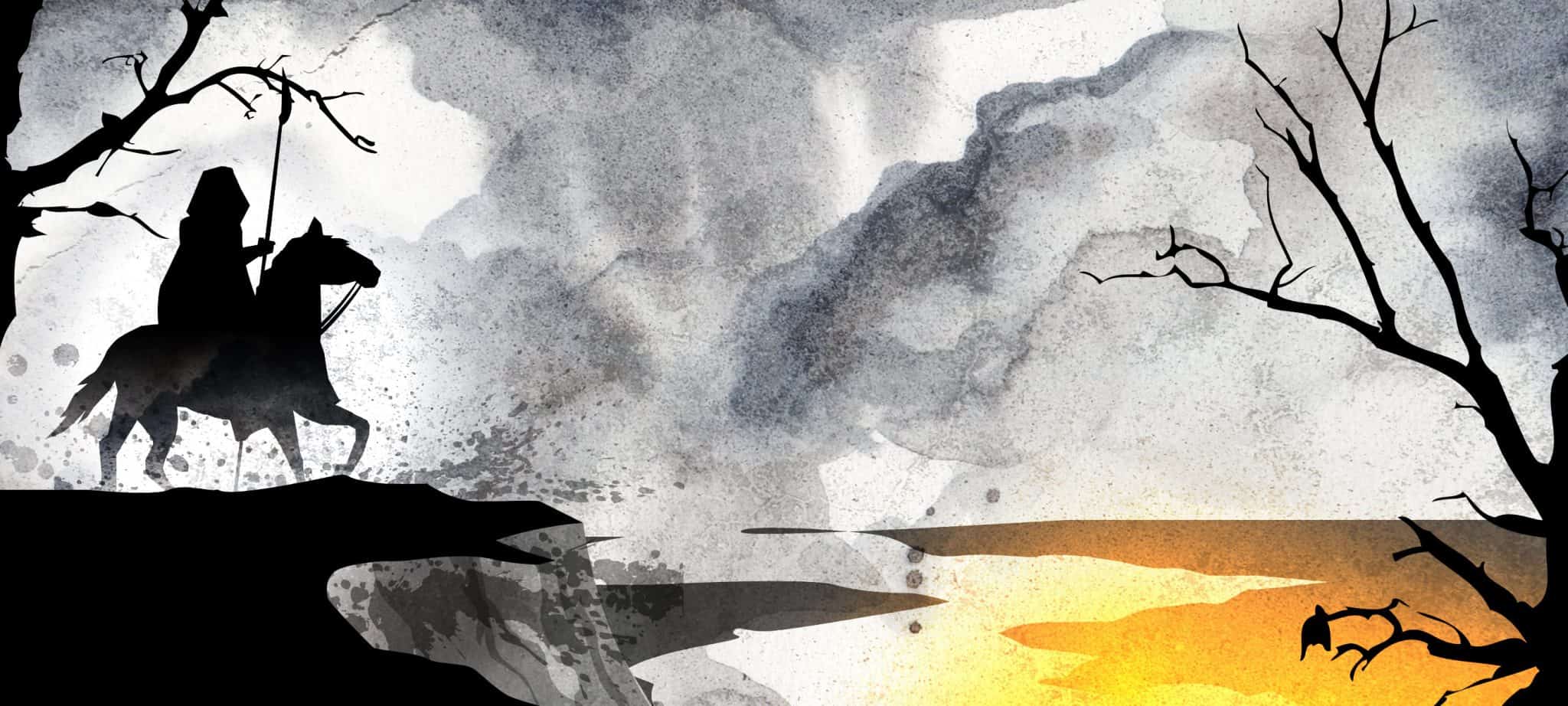
Evolving the techniques we used for the Revolution webisodes, we made the final art come alive with more visual elements like smoke textures and glowing particle effects. We added atmosphere with texture, shot shading and better overall compositions that differed frequently.
Then it came time to put the final art in motion. We designed and animated the main title sequence, with custom-created type design, dripping blood and falling leaves.
In Revolution, we mostly used X and Y but no Z spacing – in effect, we faked it. But with Dracula, we used a lot more Z space, terrain separation and sense blurs, using 3D camera movements for a look with much more depth. By exploring more of the 3D space on 2D surfaces, we achieved the look we were striving for.
–Carole Angelo, NBC Universal, on Dracula Rising Animation
