The Recording Connection of downtown Los Angeles helps students apprentice with music producers, engineers and artists in real recording studios across the country. Beginning in 2014, the audio school enlisted us to rebrand them and work on a slew of creative projects. When their new website we designed launched in August 2015, the Recording Connection saw big growth in their numbers (through November 2015):
Before we began working together, the Recording Connection had a website in place that appeared dated and overloaded with content. Our challenge was to revamp the brand and make it appeal to a new generation of aspiring students who were music-savvy and sophisticated.
Through an early discovery session with the Recording Connection team, we received deep insights into where the brand had been and where it might go. We employed a user-centric mindset through all of the branding and marketing projects we designed that helped us deliver the results the client was aiming for.
We led the Recording Connection through a four-round logo design process to image the school as contemporary and vibrant.
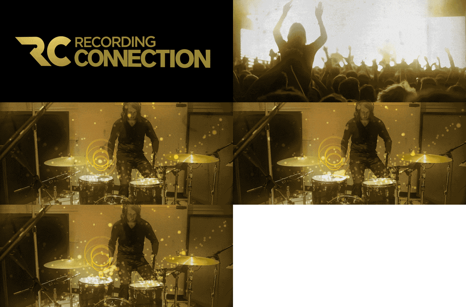
The final design composed an abstracted mark to resemble the lines of record player with modern angles. The Ns in Connection logotype were brought together to emphasize the networking possibilities of the school. Gold was chosen for the primary color to imply success.
The Recording Connection enlisted us for motion graphics work to animate and add life to video projects.
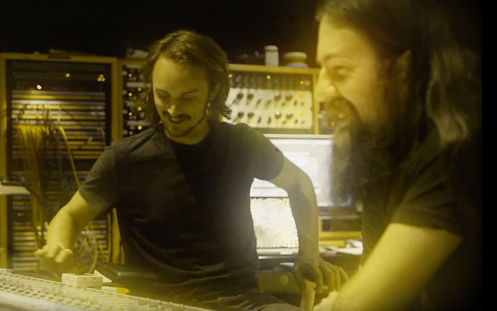
Inspired by the classic rock era of the ‘60s and ‘70s, we created an iconic look for the motion graphics shown at the top of this page. This video appears on their website with over 50 location-specific customized cuts. We edited the video, added the effects and created all graphics. We also selected and directed the voiceover actor. The piece was also used as promotional trailer in advertising.
We created the intro and outro for the Recording Connection’s new flagship Google Hangouts broadcast, hosted by industry insider DJ Iz.
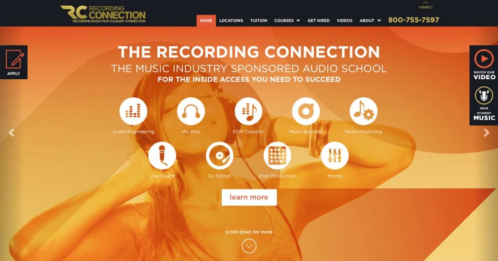
We took a user-experience approach to creating the new site, which gave us clarity in the design process and helped perspective students embrace the brand after launch.
Vibrant. Bold. And a pleasure to navigate. We crafted an entirely new custom look for the school complete with custom illustrated icons, an exciting color palette and fresh graphics. We designed over a dozen pages all told for their in-house development team to put together the website, which now totals hundreds of pages.
–Brian Kraft, The Recording Connection


