Fox Sports approached us with a compelling project. After spotting our animation work for NBC online, one of the top producers for the Fox Sports 1 TV show contacted us about a murder mystery. We denied all involvement. Then he explained he needed illustration and animation help for his documentary story on the unsolved murder of former NBA star Lorenzen Wright.
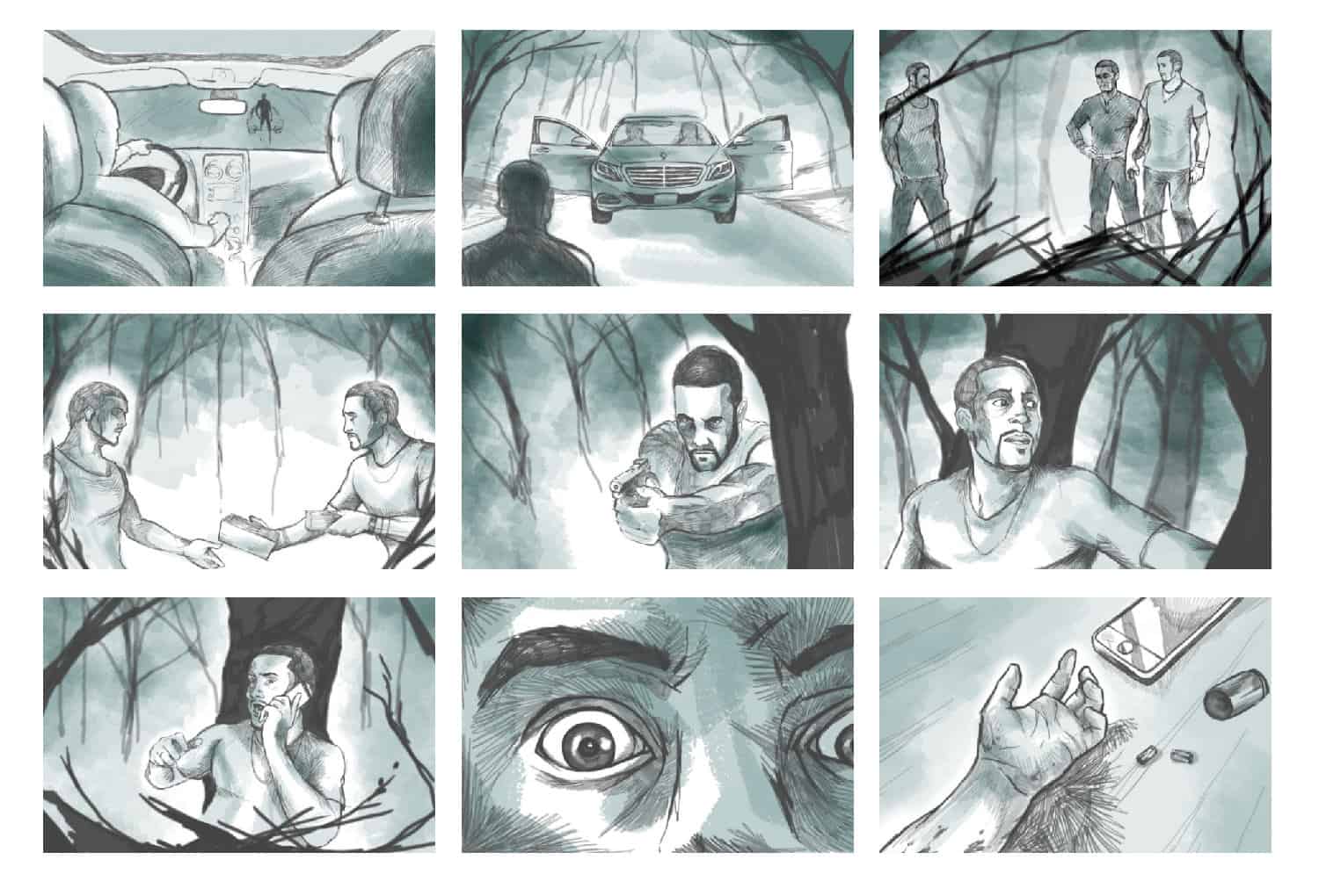
Collaborating on the story with Sports Illustrated, Fox Sports needed animated illustrations to tell the story in various scenes of what potentially happened in the 2010 unsolved murder. The motion graphics would be crucial pieces in the three-part investigative story to show different theories about who killed Lorenzen.
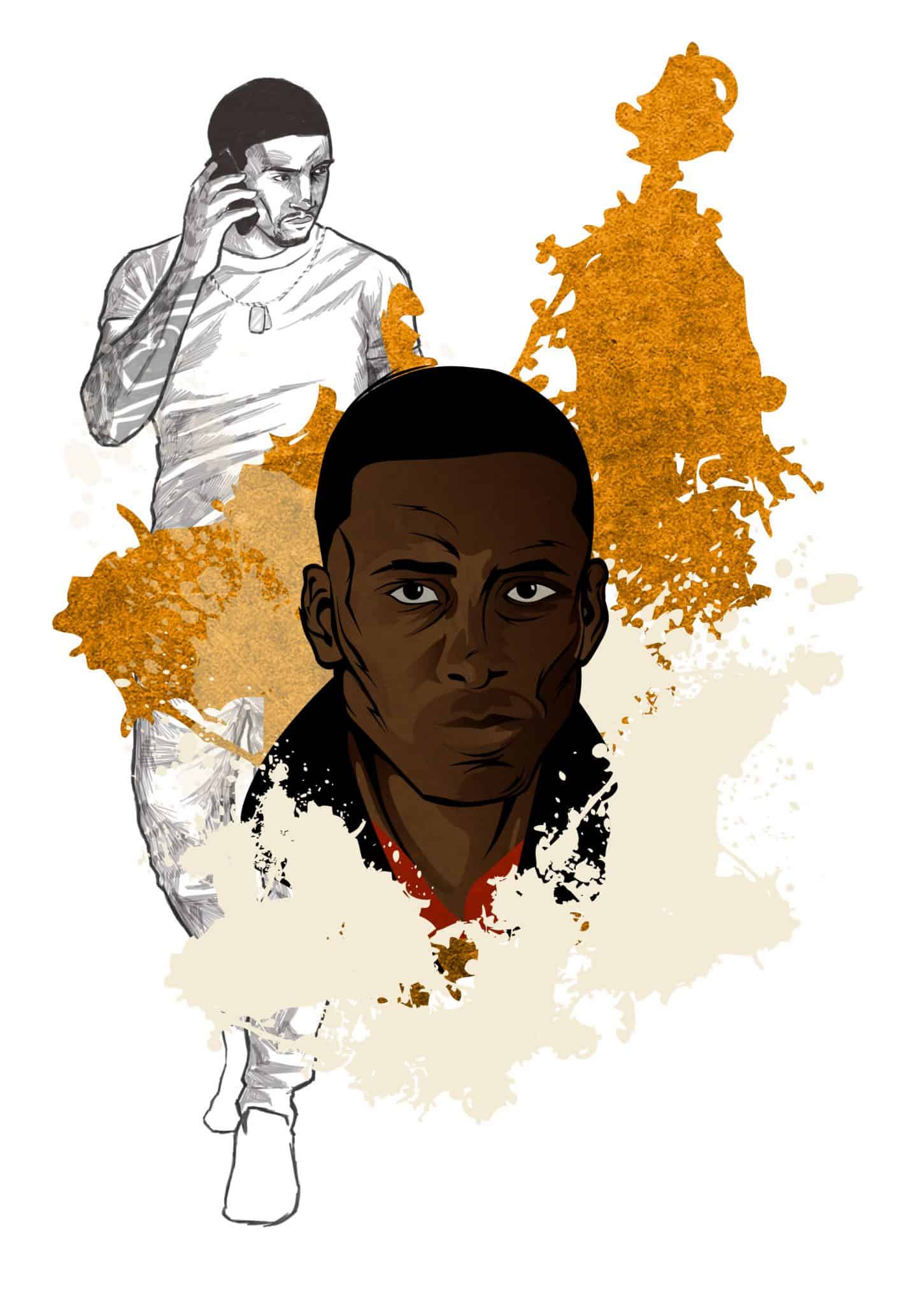
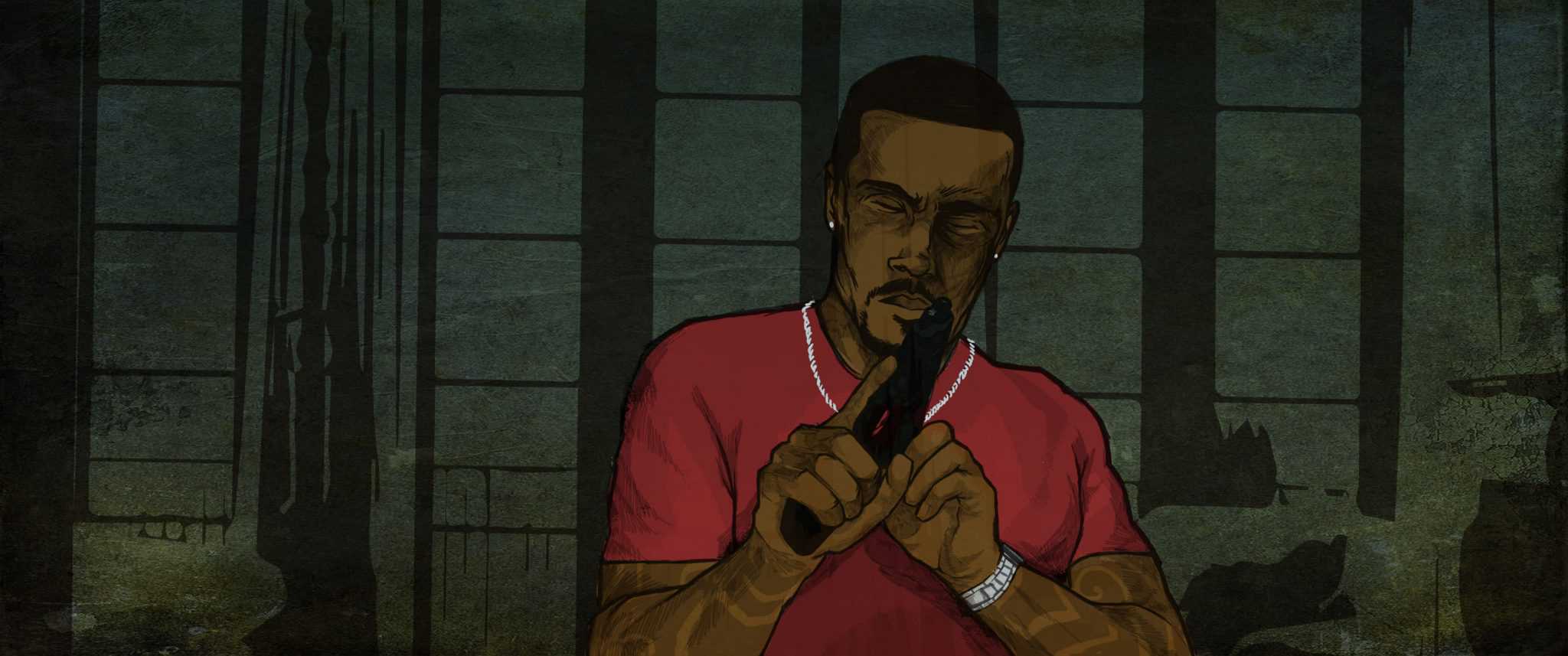
First, Fox Sports wanted to make sure we could make Lorenzen look like Lorenzen. So they commissioned us to illustrate a full likeness of him. Liking what we produced, they enlisted us to create the animations for the documentary.
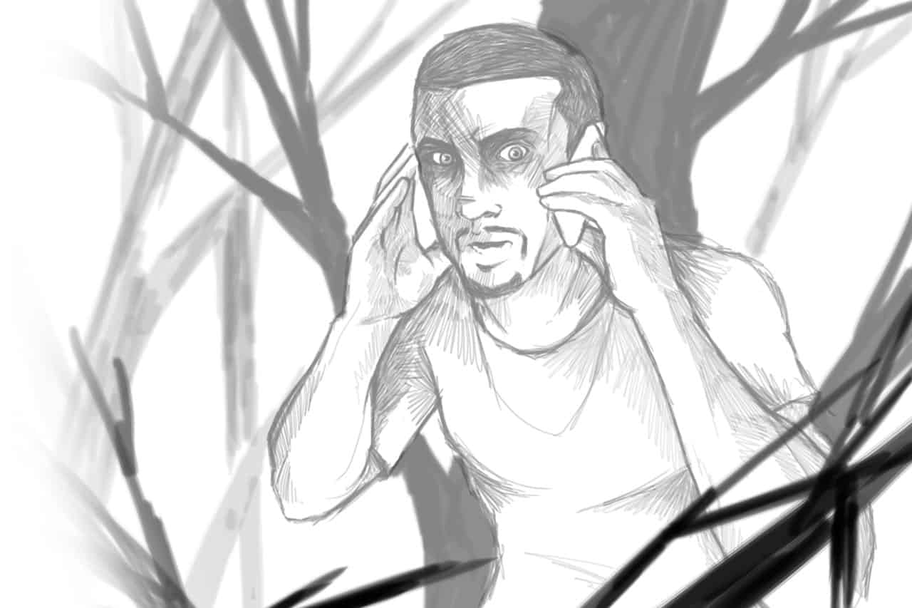
Traditionally, storyboards are usually done with pencil and paper. For this project, the storyboards were all rendered digitally in Adobe Photoshop, where one color was added to give each frame extra depth, detail and richness. Custom brushes were created in Photoshop for the pencil effect and the color brushes.
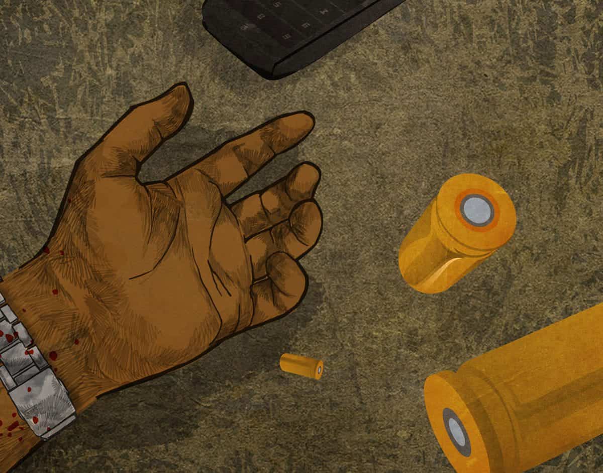
In past animation projects for NBC, we had created the illustrations with vector art in Adobe Illustrator. This time, we wanted to explore new territories and depart from that style.
We developed a more organic, stylized sketch look using Adobe Photoshop. What emerged was a new, handcrafted style – a mimicking of a natural, hand-drawn look-and-feel with custom pencil and paint brushes.
Why did we go this route? We wanted the illustrations and resulting motion designs to reflect the unsettled, incomplete nature of this case…to feel unfinished and unresolved.
The backgrounds were created in Illustrator to give a different, smoother focus to the roughness of the illustrations in the foreground. This gave the resulting motion design more of a graphic, comic-book style. Every line was hand-drawn, layer upon layer with noticeable individual sketch marks, and then all painted and colored with brushes.
Fox Sports loved the look and feel of the motion design for the webisodes we created for NBC’s Revolution TV show, so we employed that style again but evolved it.
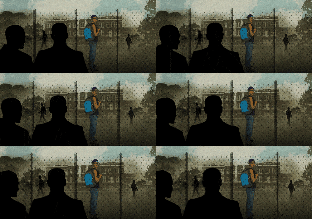
We worked back on a 2D canvas, faking 3D Z-space to keep the focus on the illustrations. The movements needed to be subtle so we let the illustrations and the phone call sound-overlays create the story.
Elements were placed and scaled to imitate 3D space. Each depth was grouped (foreground, middle ground, background) and then moved at different rates, either scaling or transitioning left or right. Each element within the group would then be animated to do the same movement, at different speeds. When the layers were compiled, we were able to imitate faint, yet complex, camera movements, in an artificial 3D environment.
–Matt Schlef, Fox Sports

